Context
Project Brief Design an e-commerce website for the fictitious brand True Spirit: school uniform retailer for schools and parents who want a modern school uniform for children from K-12. They provided personas. Problem Most online uniform retailers provide lousy user experiences. Some of the most used retailer don't have a way to browse easily through their products nor present quality images.
User Web-savy parents preoccupied in getting the right items for each school, and school administrators looking for items to include in the dress code. Solution A website based on the previous e-commerce experiences of the personas that satisfies user and the business goals. It has easy access to each school dress code. It must have open browsing so schools and parents can do business with them.
Other Details
Challenge
•Using only the personas and short research provided to make decisions
•Design and prototype several user flows of an e-commerce in a single week
Timeline One week of UXDi course at General Assembly Spring 2014 My Role UX Designer - Solo
1. Research + Strategy
The brief included personas but I also complemented it with informal interviews with neighbors and shared information of other people within the class.
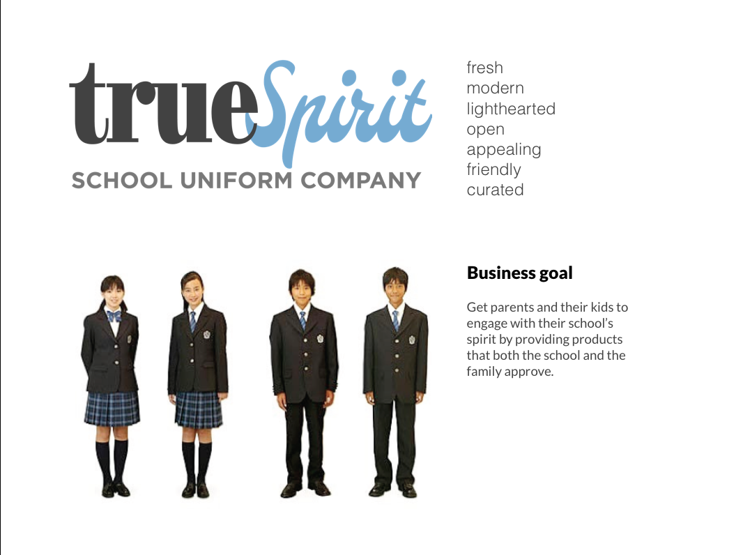
• I defined the business goal based on the description of True Spirit brand and the brief provided.
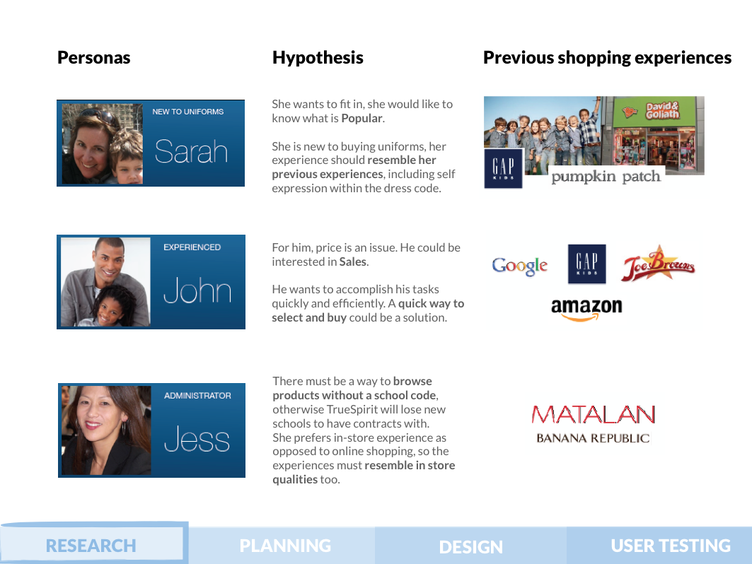
•I analyzed the personas and hypothesized possible solutions that addressed their goals and character.
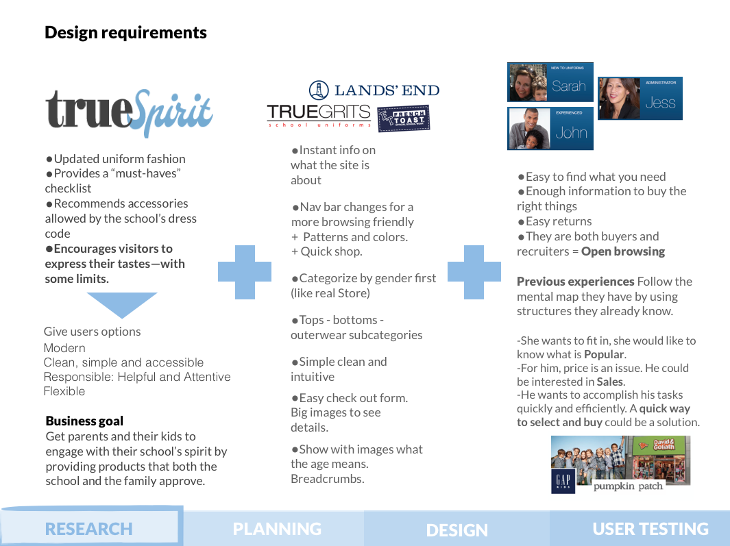
•I made a competitive analysis using the brand's competitors and the user's previous e-commerce experiences. I evaluated which websites and features accomplished the True Spirit users goals. All these variables were used to define the design requirements for the website.
2. Ideation
Information architecture + Sketching + User flows
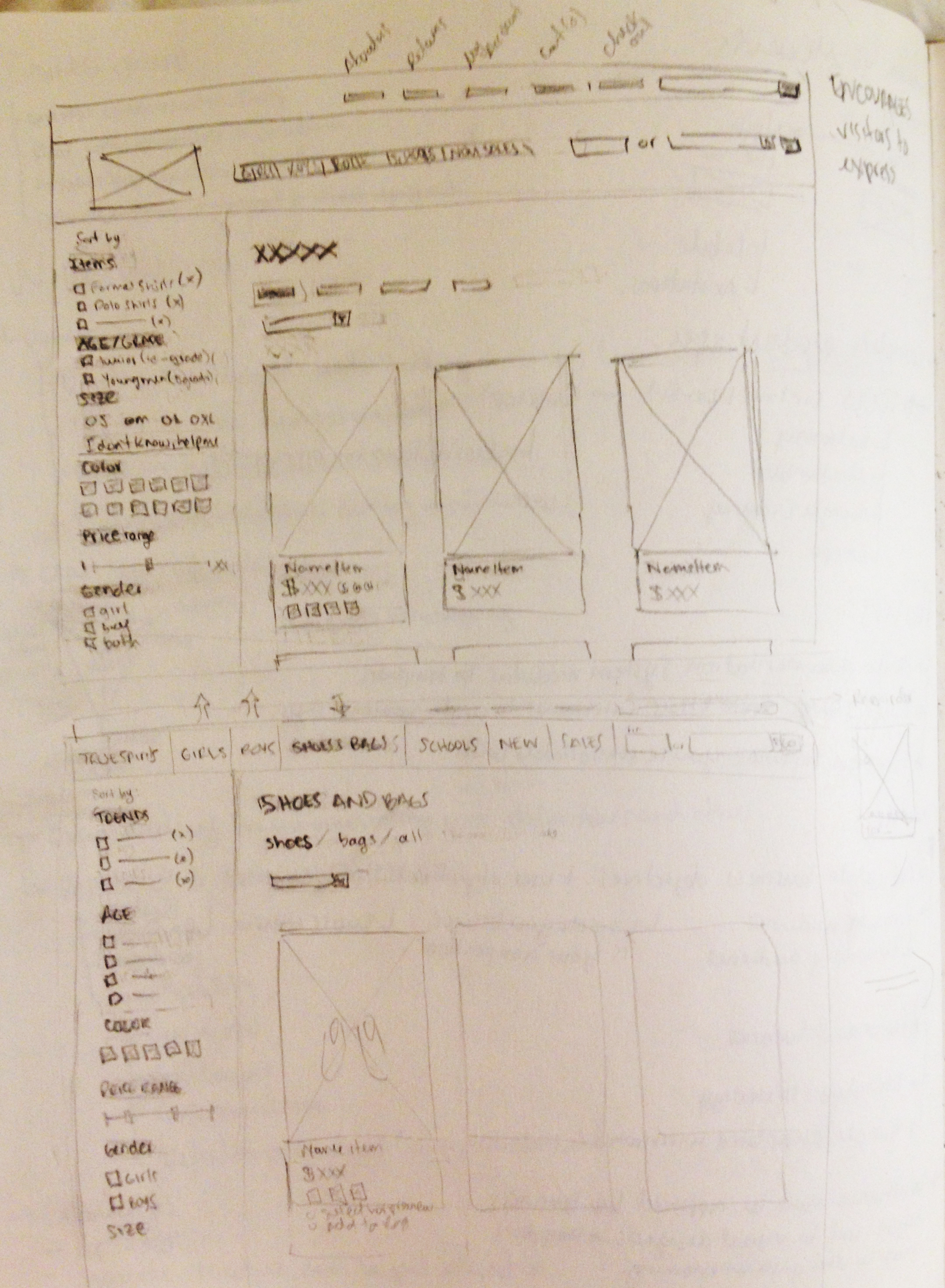
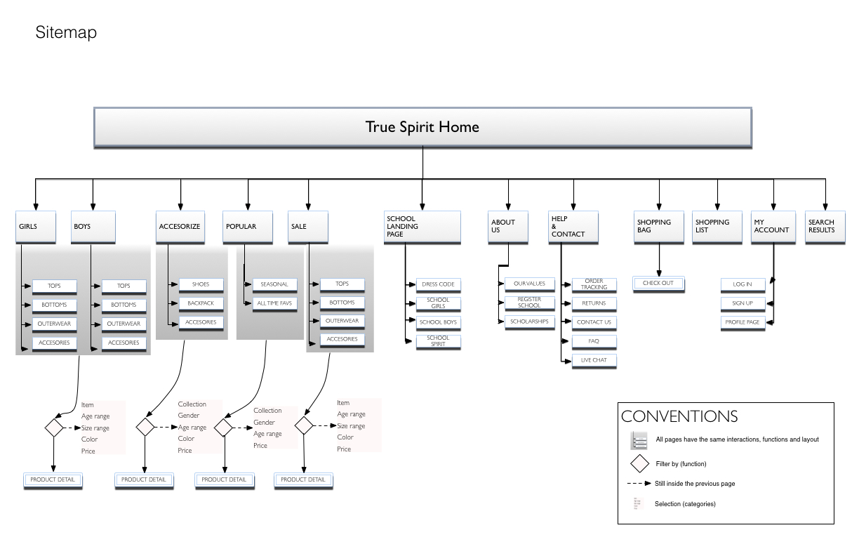
I made the sitemap by using the high level design requirements to sketch a global navigation and test the category names.
Then I designed user flows and asked my colleagues for quick feedback. I iterated by sketching corrections, categories and user flows.
In each iteration I refined the design and narrowed down to more specific details such as filter categories and content. Always keeping user and business goals in mind.
Final sitemap
Final user flow for prototype
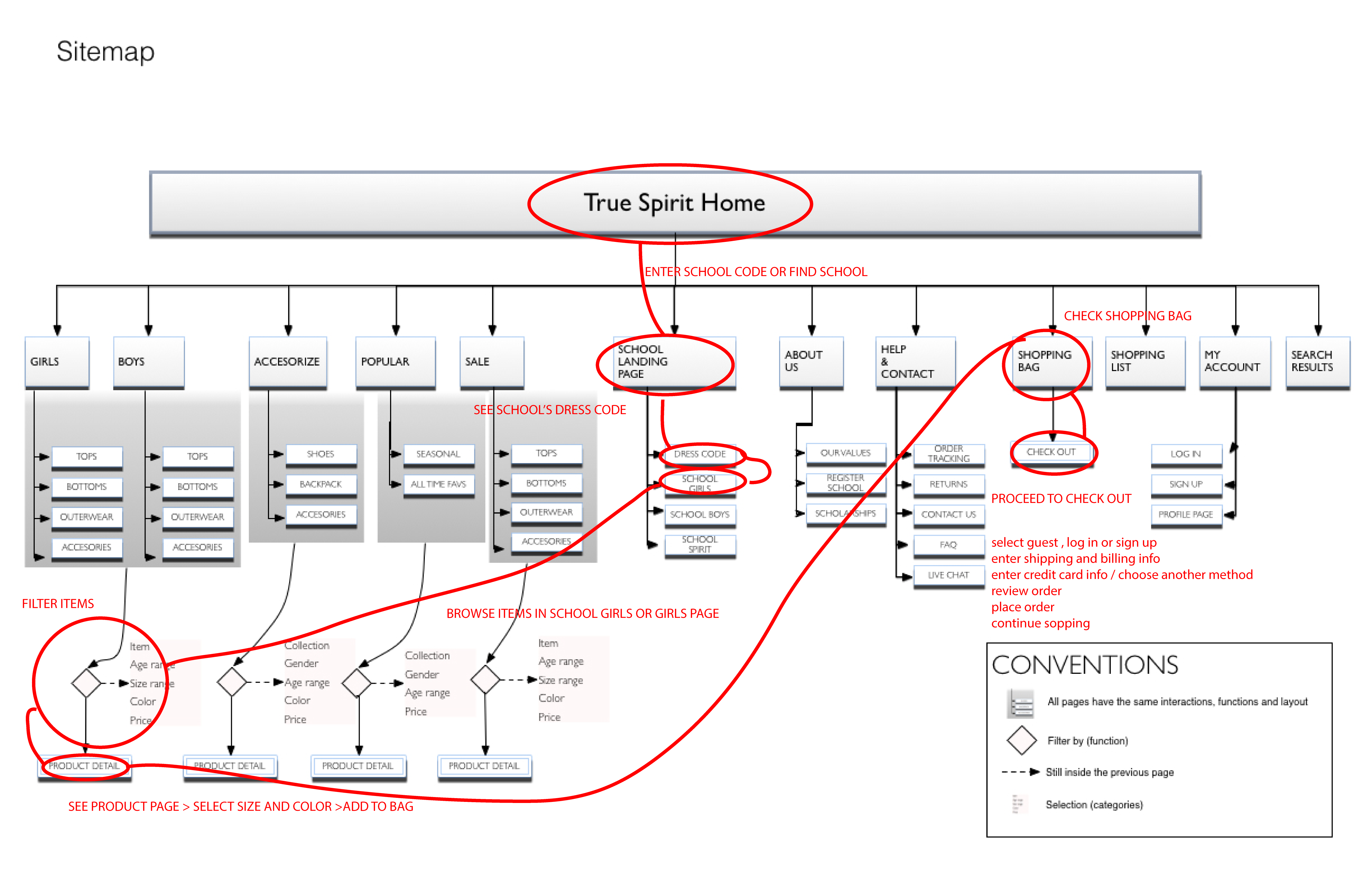
3. Prototyping
Prototype and User Testing
I made the website's interactive prototype in Adobe Muse. I made several small iterations in order to get feedback fast and made the corrections on the spot.
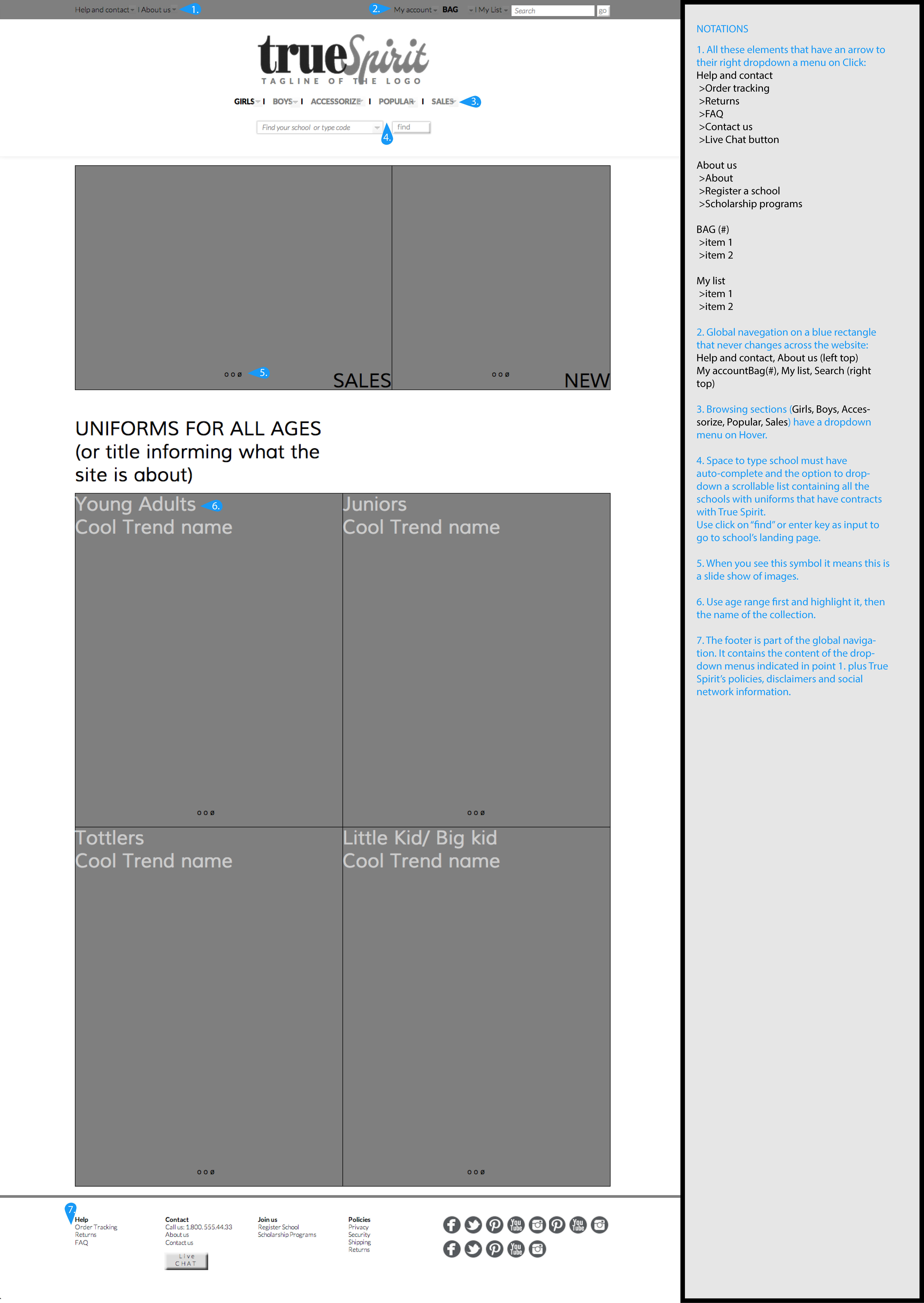
Wireframes with user feedback notes to use for next iterations
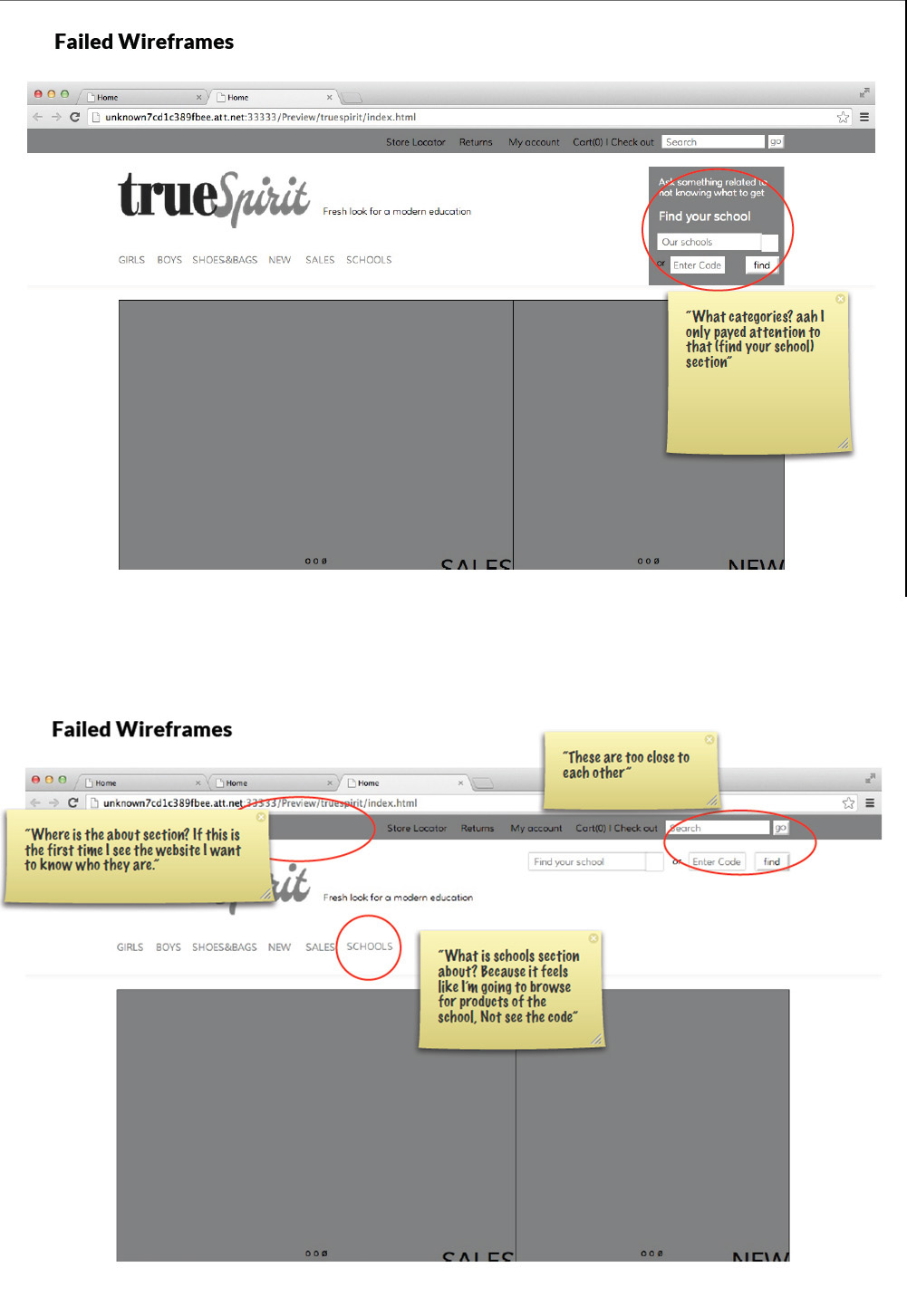
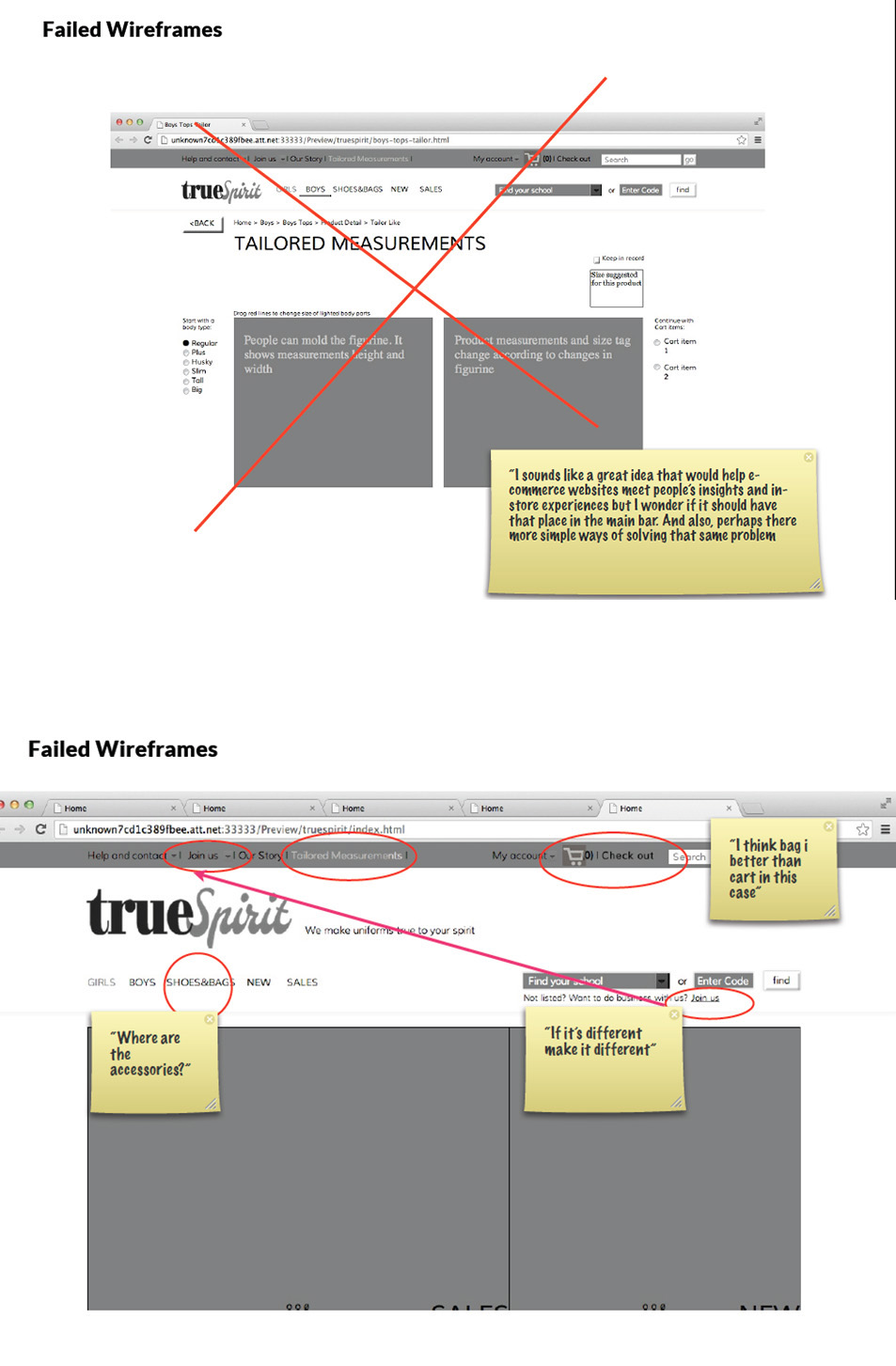
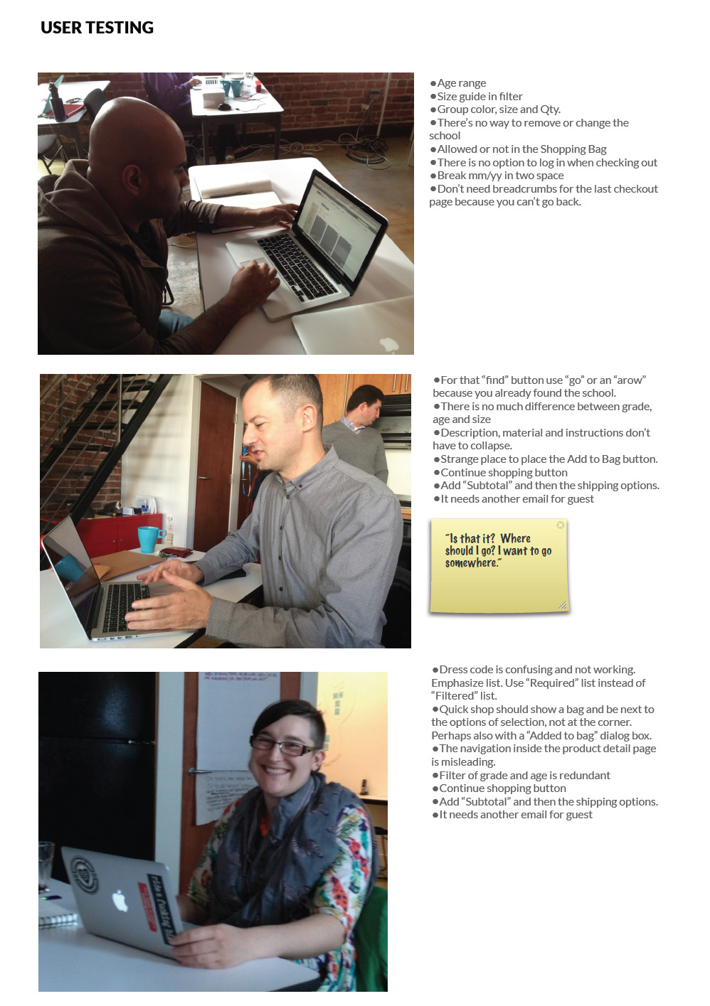
Users and their comments
Annotated wireframe of the home page
Your task is to buy a girl's shirt
Try PrototypeProcess
1. Research
- Brief Analysis
- Personas Analysis
- Competitive Analysis
- Strategy
2. Ideation
- Sketching
- Sitemap
- User flows
- Iterations
3. Prototyping
- Wireframes
- Muse Prototype
- User testing
- Iterations
4. Presentation
- Presentation Deck
- Presentation to employer
- Wireframe Notations