Anza Historic Trails
Helping hikers find relevant trail and historic information to plan their trips
Try Prototype"Find Anza diaries of
the Rob Hill Campground"
Context
Project Brief My employer wanted to propose a mobile app for hikers finding info on the go to their client the National Park Service. My job was to evaluate the situation and make recommendations before moving forward. Problem The website isn't responsive and has inaccurate map data. The info needed is hard to find and uses technical language. All because institutions give confusing data and terms through a "map collaborator" form.
User Hikers with interest in chicano history. Most Anza territory has bad mobile coverage. To plan trips they need detailed trail info. For mobile use, they need directions and near by amenities. Solution To make a mobile version of the current website. To manage people’s expectations of how accurate info can be by giving links to info missing and making the needed info visible. That required translating technical terms into common language.
Other Details
Info about Anza
The Anza territory is the route used by the colonizer Juan Bautista De Anza and hundreds of his followers to enter US territory. It goes through different park jurisdictions.
Timeline
4 weeks part time - Oct./Nov. 2014
Challenges
• Multiple institutions collaborating in building the map with inaccurate trail data left the NPS without much control over the issues users needed help with
My Role
UX Researcher and Designer Consultant - Lead/Solo
1. Research
I organized the interviews data into "what" activities people performed, "how" they did it and "why". I could identify what type of information they seek out of Anza and the pain points of the experience: from planning a trip on the desktop to mobile access in the trail
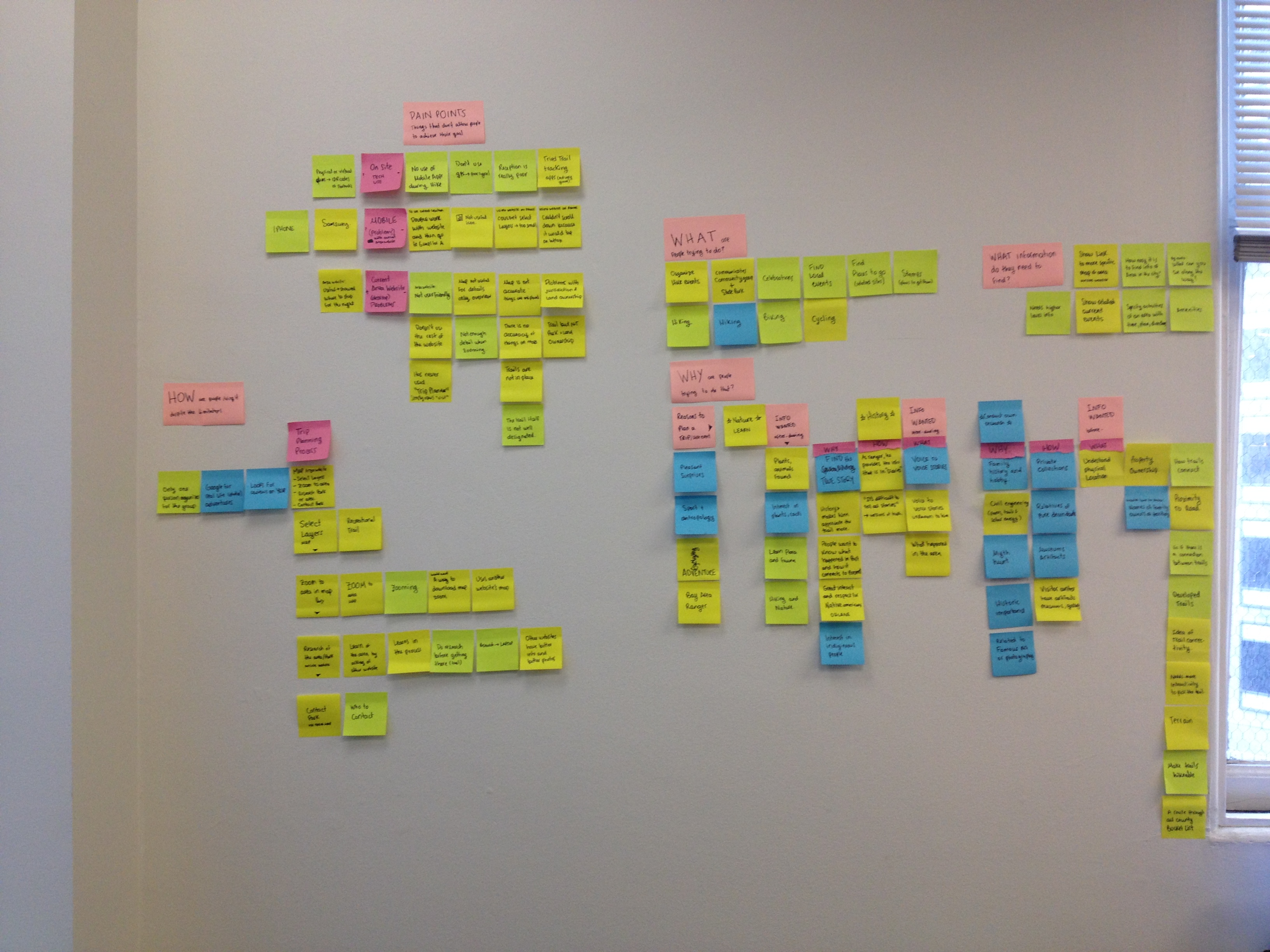
Interview discoveries
•People use the site to plan their trips. Still, people forget details on the go and visit the website for help, but it isn't helpful for 2 reasons:
-The website isn't responsive and it's hard to access from a mobile. Plus, most of the territory has bad mobile signal.
-People only use the map, but the map has inaccurate and missing data. People don't expect this.
• People expect: first hand history sources, high level info of community events, and nature and physical attributes of the trails. Part of that information is there but it's hard to find.
• My conclusion: NPS has to ask better questions/info to their collaborators.The form to add data and the data displayed needs to change so info available is visible.
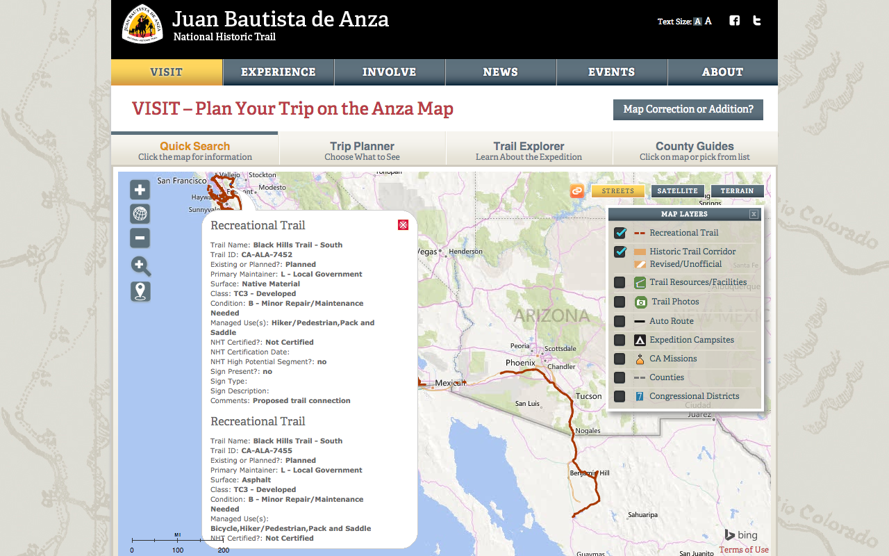
Go to the website here. This image is a screenshot of the map page. Notice where it says "Map Correction or Addition?". That is where you will find the form to collect data of the trails.
This image shows the info people ask for and need is there, but you can barely see a scramble of technical words that make no sense. This should be "translated" and displayed graphically.
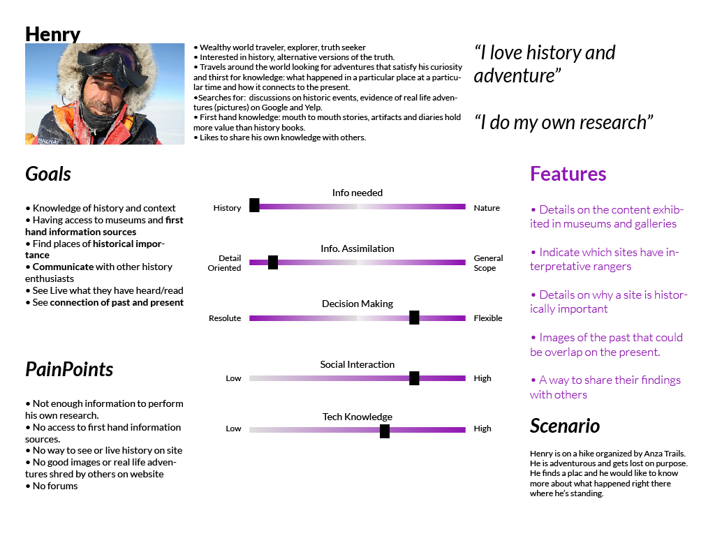
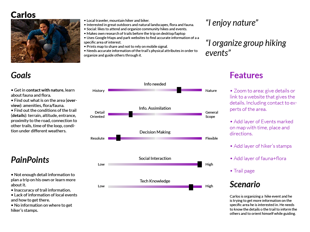
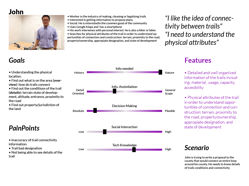
Personas
The main persona is Carlos because he is the most recurrent website user. John would be the main user of the trail data collection form.
2. Ideation
Scenarios, User Flows, MVP and Sitemap
1. I used scenarios to imagine what Carlos, Henry and John might do and feel. This helped me create micro-user flows as solutions to each scenario. Thus, I also determined features needed.
2. I prioritized actions and features according to the personas' goals.
3. I designed the sitemap and the user flow according to that prioritization.
This only work if I have absolute understanding of the users, which is why I prefer to be the interviewer in all my projects.
The process wasn't linear. At the beginning I didn't have access to the client. So I did the app and afterwards I met the client while user testing with a ranger.
I learnt why the data was inaccurate among other things. They wouldn't invest in an app, but into making the website good for mobile use.
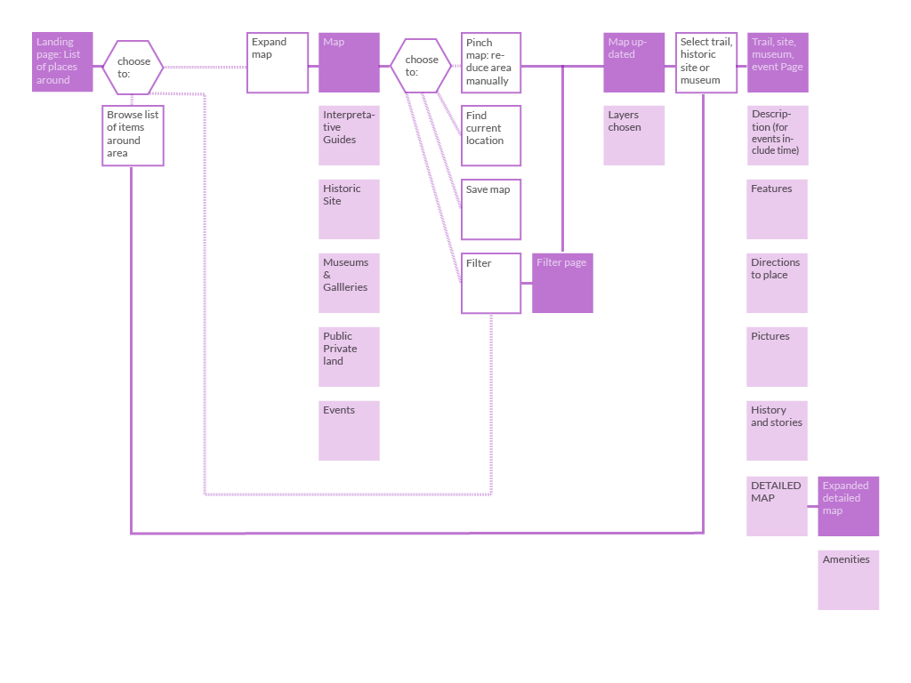
Key Full color squares: pages and content --- Empty squares : actions
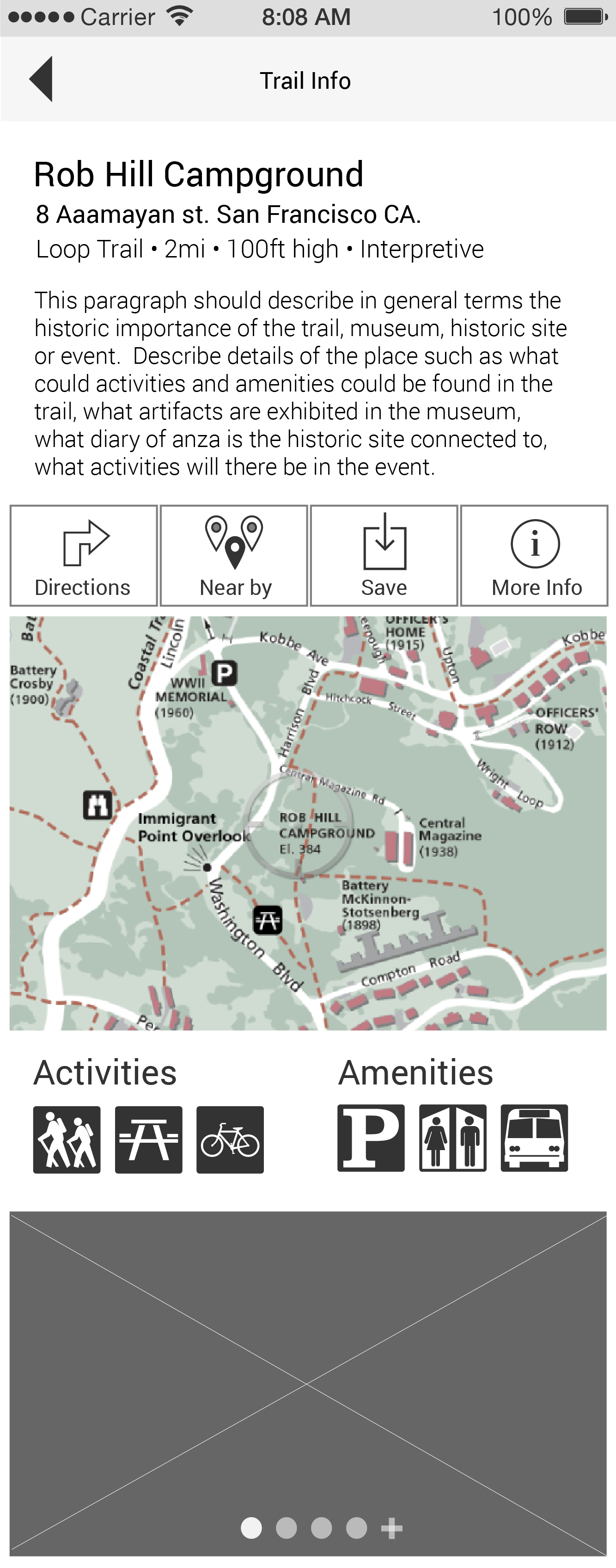
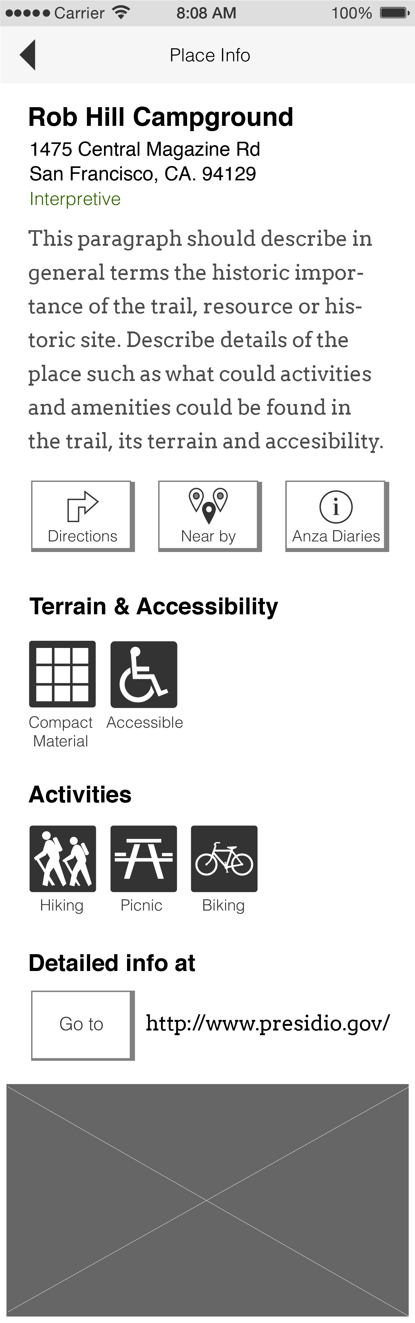
User flow of the mobile app that couldn't exist. It included detailed info that the NPS didn't have, such as Trail Amenities.
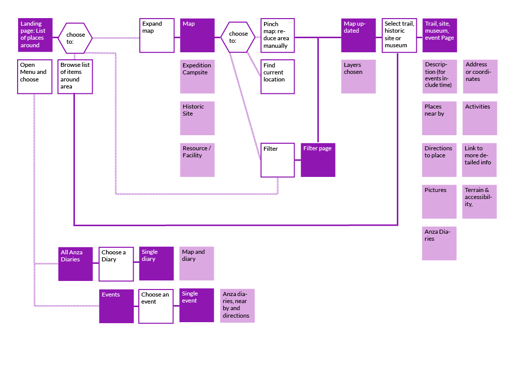
User Flow of the mobile version of the website (making a responsive website would be too costly)
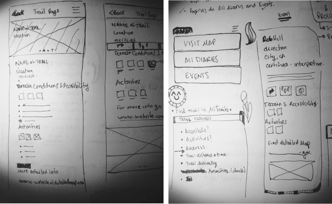
Interface sketching and design definition
Sketching each main screen helped me see the holes in the user flow and helped me make adjustments. I asked friends and colleagues for quick feedback then I began digitizing approved ideas in Illustrator.
3. Prototyping
A difference between the ap and mobile website relies in technical capabilities. For example: An app could allow to save a map in the phone while a less costly way to this for Anza would be to provide a link to the website that already have detailed maps of each trail and parks.
Try the prototype: your task is to save the map to the Rob Hill Campground
I tried the mobile website approach prototype and received positive feedback from users and the client. Anza supported my idea of changing the collaborator.
Filter the map and/or find directions to the Rob Hill Campground
4. Presentation
Presentation to GreenInfo Network
My employer felt satisfied with my work. They felt impressed with how I dealt with the client and tried to solve their concerns. They decided to implement my suggestions and bargain with the NPS for funding.
Diana loves solving complex information design problems. She's able to learn about and conceptually organize large sets of data and other information, and develop user experience/interface approaches that get at the best approaches for making that information accessible. She has good process tools for interviewing stakeholders, organizing and prioritizing systems of information and reporting back on good designs.
– Recommendation by Larry Orman
Executive Director, GreenInfo Network
Process
1. Research
- Competitive Analysis
- Content Inventory
- Interviews + Insights
- Research synthesis
- Personas
2. Ideation
- Scenarios + User Flows
- Strategy + MVP
- Sitemap
- Sketches
- Design definition
3. Prototyping
- Wireframes
- InVision Prototype
- User testing
- Iterations + Repeat
4. Presentation
- Presentation Deck
- Presentation to employer
- Wireframe Notations