Servas
Expanding Servas mission to younger audiences by redesigning their website and application process
Try Prototype"Apply to Servas"
Context
Project Brief Servas, homestay travel non-profit that promotes peace through cultural exchange, wants to expand their message to younger audiences and fix the application process. Visit their current website. Problem Users can’t understand what Servas is or what it offers. The website is out-dated, text-heavy with no good IA nor clean copy. Even if they do understand and like it, they do not feel encouraged to apply. This is because the application process is long and inconvenient.
User Curious, outgoing young travelers. They are tech-savvy and have expectations of online experiences. Their goal is to feel excited about traveling and meeting new people. They want to easily connect with others. Solution Our strategy was to focus on images of people&places and provide a short copy and simple nav. Thus the entire website needed to change. We divided the application process into visible steps. We tried to make a connection between offline and online procedures.
Other details
Challenges
•Servas is an international organization so many of the procedures cannot be changed.
•Large age ranges between users
•Designing an online experience aligned with offline experiences
Results
This project allowed Servas to request around $20000 in donations to rebuild their website.
Timeline 2 weeks and a half as UX designers/consultants contacted via General Assembly My Role Lead UX Designer and Researcher Team Jennifer Clyde
1. Research
Understanding the product.
•Text-heavy content
•Content repeated in different pages
•No images
•Many pages were empty or contained a single link to a 30 pages pdf.
•Some of those links were repeated in other pages
Findings: users expect..
•Viewable member profiles
•More pictures and stories
•A clear and straightforward sign-up process
•Member id verification or member feedback/reviews
•To communicate with other members thru the website
Click the image to read a digitized version of this Affinity Diagram

We created Personas to guide our decisions. The main user is Jess because she pays the highest fee and she is the young audience current members want to recruit.


2. Ideation
Strategy
We created a strategy according to the research:
• Jess is uncomplicated and like immediacy. She needs easy access to clear information: short nav, short copy, visual cues to guide her.
• She is a very visual person. She needs the website to change from text-based to image-based with friendly visual design.
• Jess is tech-savvy. She expects things modern website features like member profile pictures and messaging.
Sitemap and Content inventory : short nav
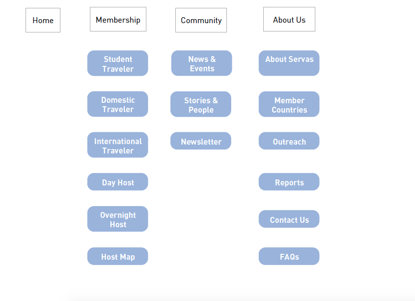
We agreed to make a simple 2 levels nav. We chose and tested the labels together. We focused on making sure people can understand what Servas is and what it offers.
Proposed sitemap
Application Process User Flows
Jess didn't understand how to access an interviewer nor what were the next steps.
We used scenarios to figure out what Jess would do instead:
•Jess would have expected to have a messaging feature to contact that person.
•She would have expected straight forward instructions.
Analysis of current process: That big "?" on the image is when you see a "Status:Pending" but there are no clear directions for next steps
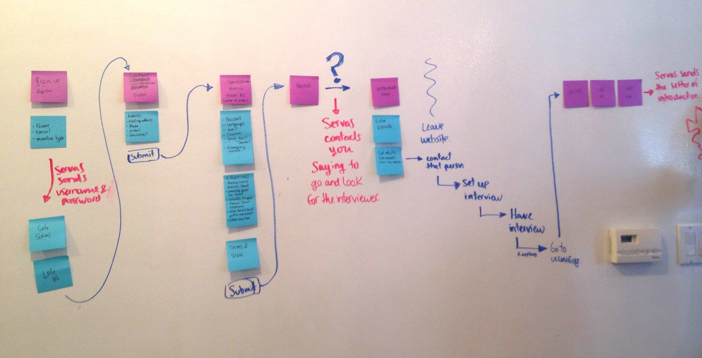
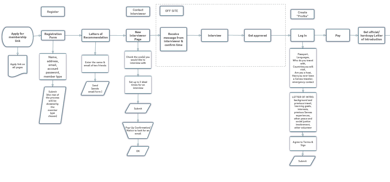
Designing the new user flow: Jess would expect clear instructions and a way to send a message. She would choose the interviewer depending on their profile picture. So we provided a way to find + choose an interviewer and set up a meeting in-site.
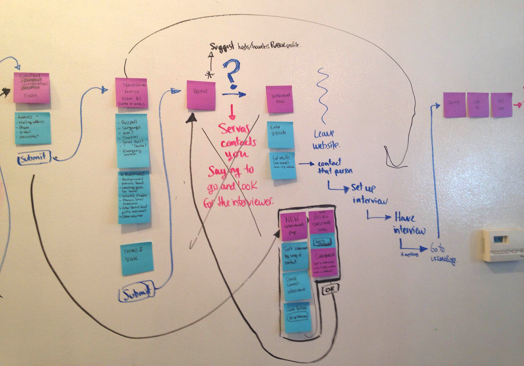
We tried to make clear connections between online and offline procedures. The "Letter of Introduction" or profile form is a long form but we couldn't changed it due to bureaucratic reasons. We just divided it and made it digestible.
Interface sketching and design definition
We based the interface design in my sketches, which I based on our strategy: focus on images of people and places, explain what Servas is in a short copy and visual cues. The sketches were clear enough to help us ask other people for their opinion and make changes on the spot.
Home page sketch 1: we need something standard and full of images
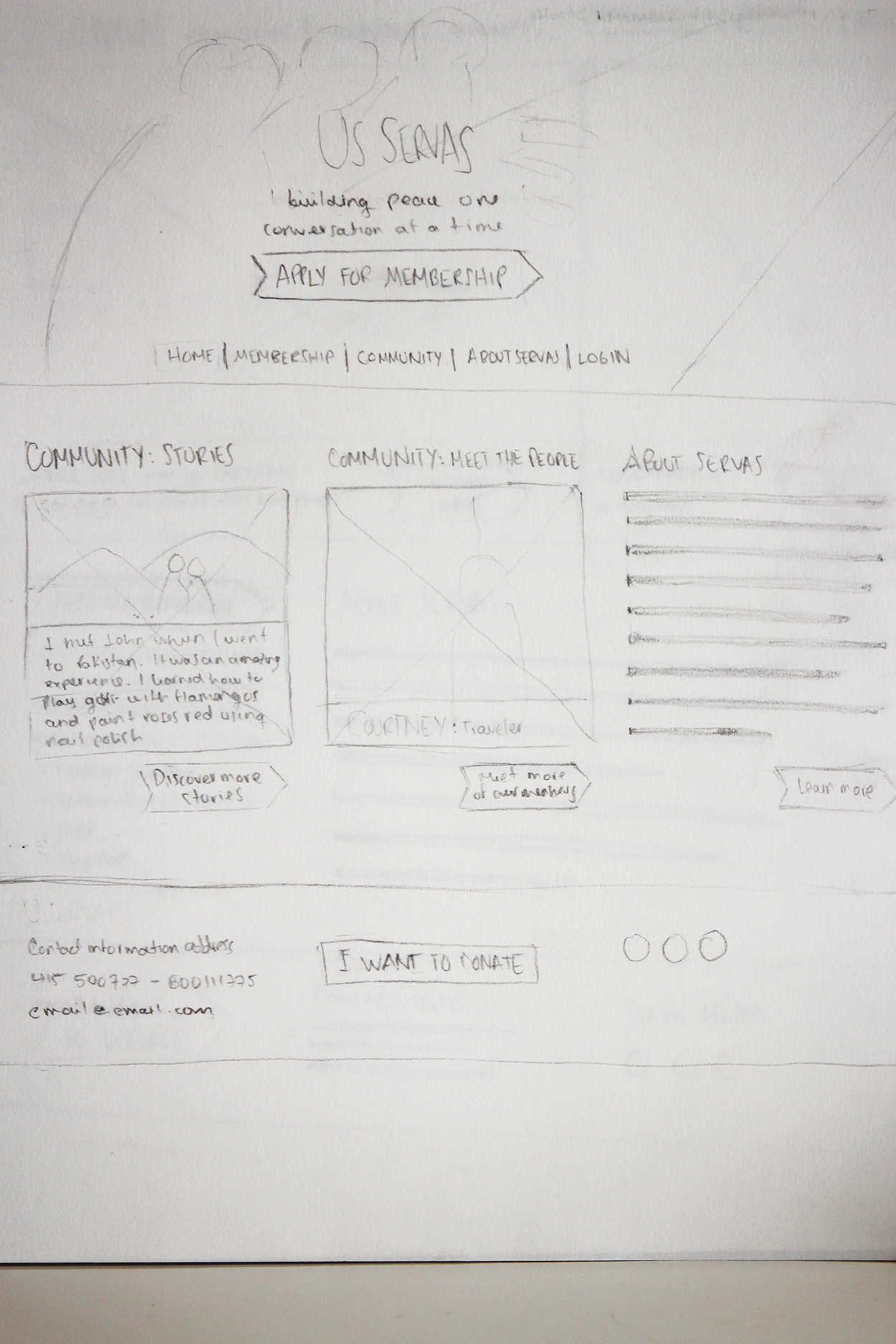
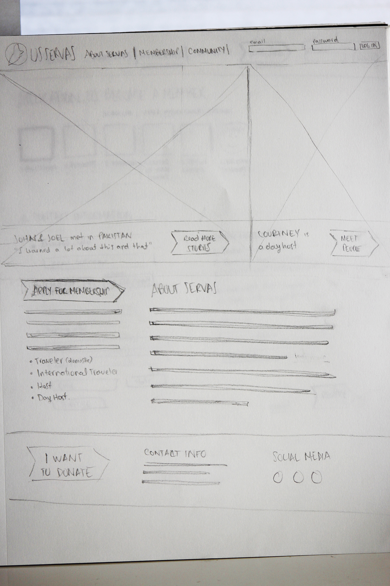
Home page sketch 2: maybe with more focus on stories and people
Application process Request page sketch: people need to know what's coming, when everything ends and they need more simple ways to do what they have to do, like sending a form digitally instead of using postal mail.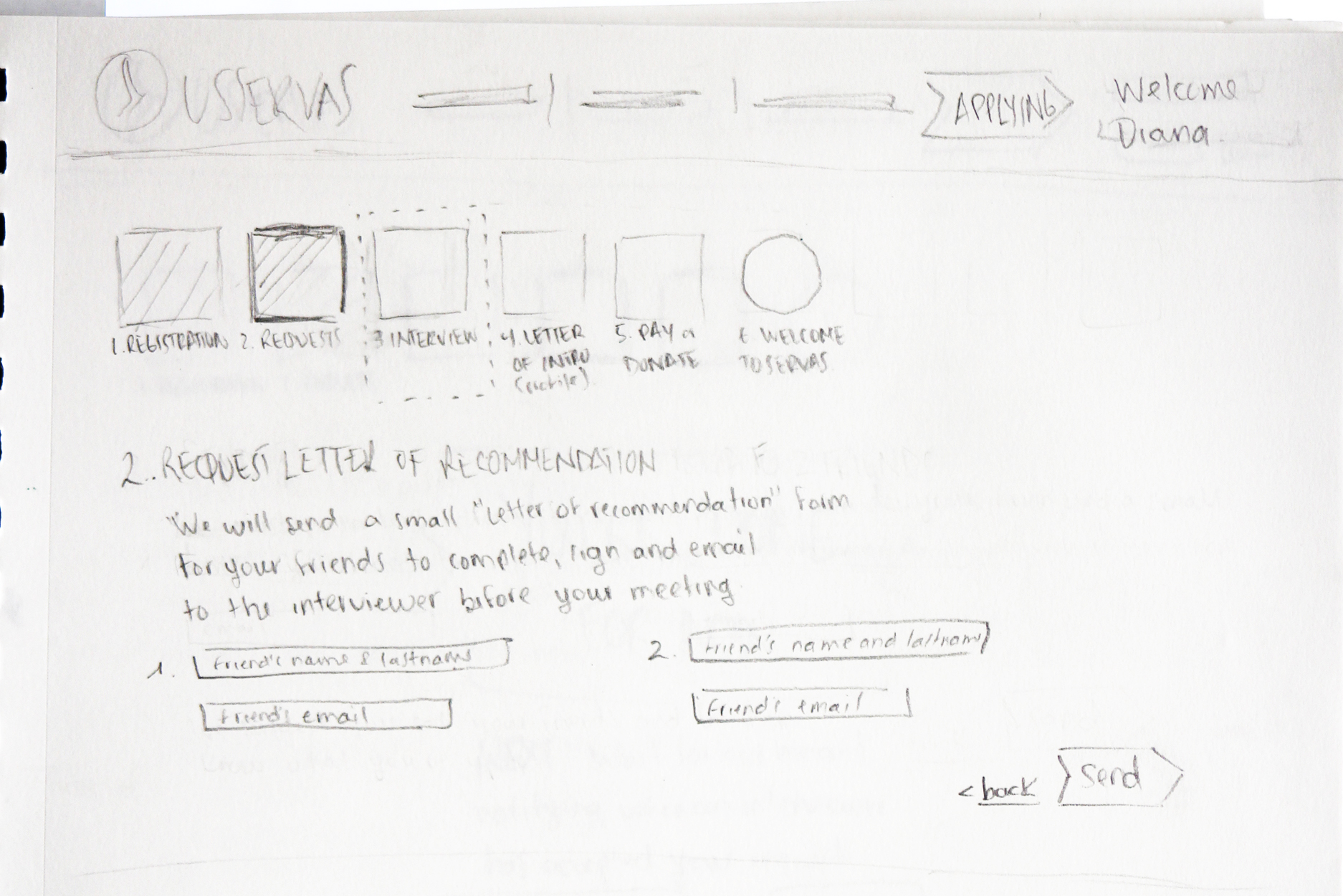
3. Prototyping
Defining visual design
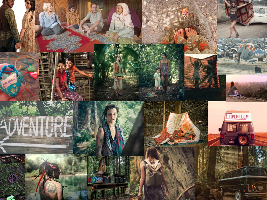
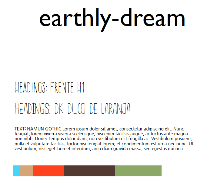
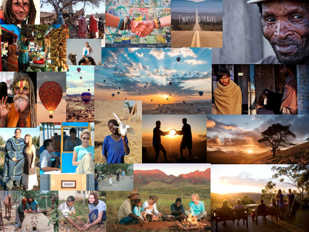
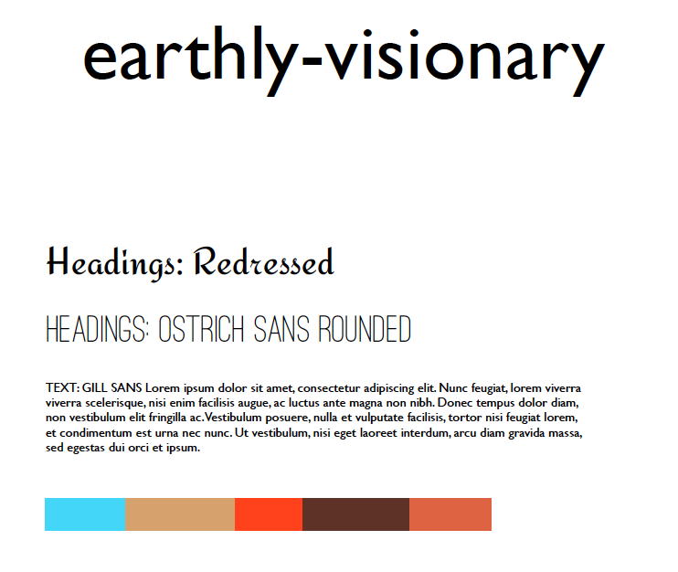
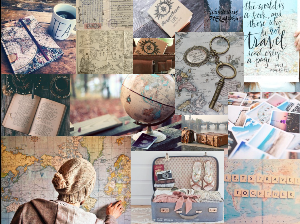
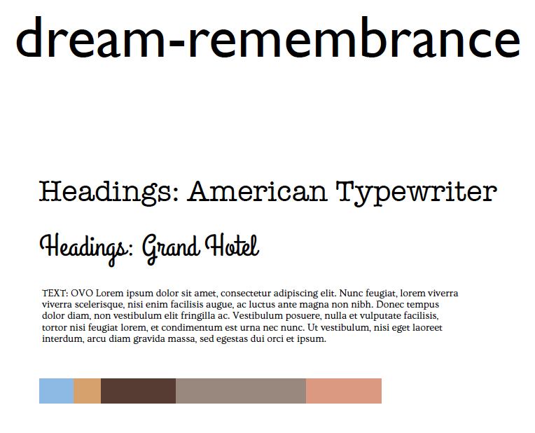
I created moodboards that integrated the Servas' identity + Jess's imagery of traveling and sources of inspiration. I used them to create the wireframes' look and feel. We offered Servas 3 big themes:
1. Earthly-dream: imagery from the globetrotter and curious about people side of the travelers. The best match for Servas.
2. Earthly-visionary: imagery from the peace making and volunteer side of the committed travelers.
3. Dream-Remembrance: imagery from the romantic wanderlust side of the younger travelers.
Wireframes, Prototype and User Testing
I made the wireframes: short copy . My partner used the wireframes I did in Illustrator for the Marvel app prototype.
We then proceeded to recruit current young members to test our solution. They could appreciate the difference with the current website and approved the general approach to the problem.
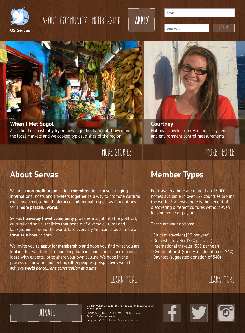
Wireframe: home page explaining what Servas is and what kind of community it is
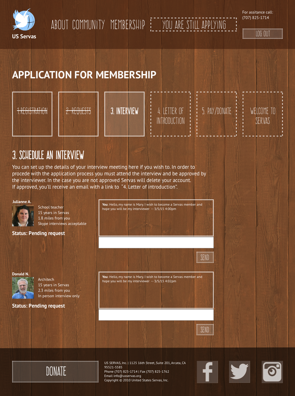
Wireframe: pending interview request page where you can message the interviewer
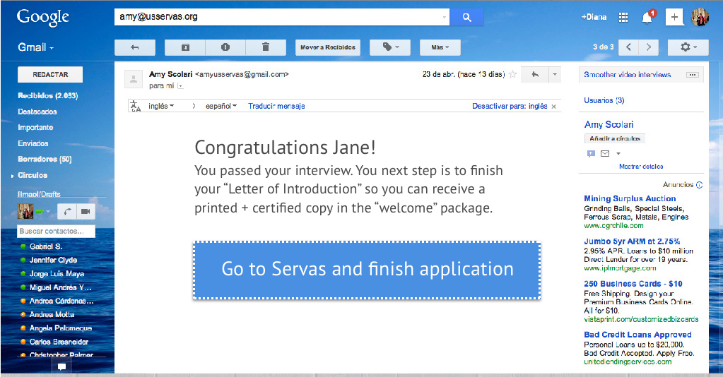
We used email wireframes to establish the connection between online and offline procedures
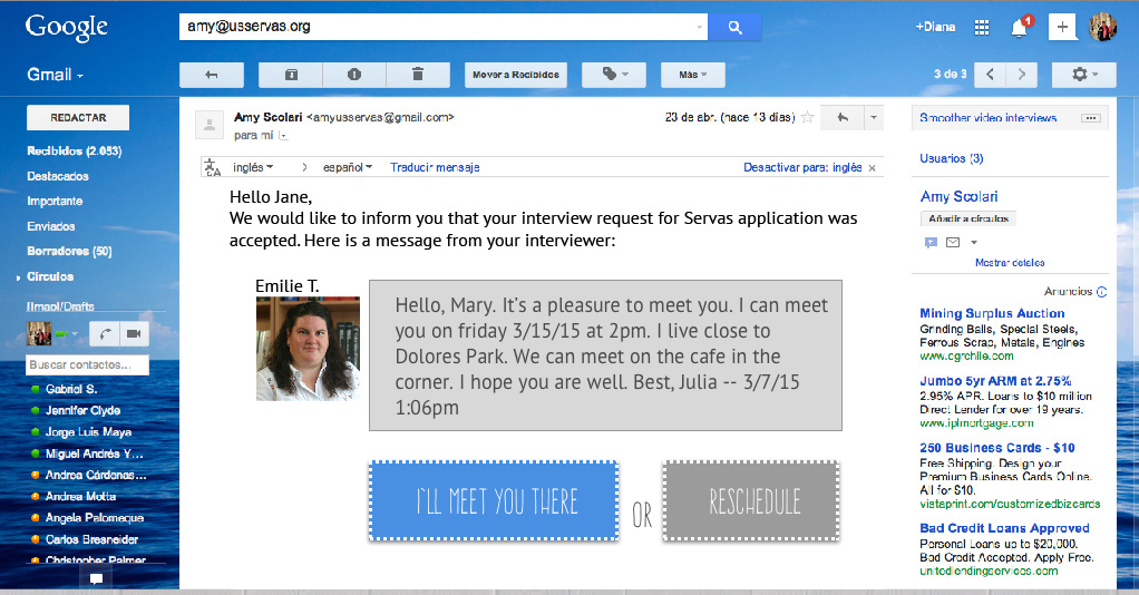
The email wireframes link from an interview request to after the interview is done and approved.
4. Presentation
Client Response
Our client understood the changes were necessary. They worried about money to put them in place and all the bureaucratic decisions for approval. But they felt encouraged and excited to do it. In general, they were satisfied with our work. The following recommendation from my LinkedIn profile proves the results.
Diana was part of a 2 member team to help suggest a complete redesign of the US Servas website, usservas.org. The suggested redesign was so clear and powerful that the US Servas board was energized to fund a full blown redesign based on her vision for a new US Servas website
– Recommendation by Mary Jane Mikuriya
Peace Secretary, Key Person Committee, N Calif. Regional Coordinator, Interviewer at US Servas
Process
1. Research
- Survey
- Interviews + Insights
- Competitive Analysis
- Content Inventory
- Research synthesis
- Personas
2. Ideation
- Scenarios
- Strategy
- User Flows
- Sitemap
- Interface Sketching
- Design definition
3. Prototyping
- Mood Boards
- Visual Design
- Wireframes+Content
- Marvel Prototype
- User testing
- Iterations
4. Presentation
- Sitemap and user flow images
- Presentation Deck
- Client Presentation
- Wireframe Notations with design instructions for content, looks and behavior of the interface
"My role" Key
: Solo.
: Co-created with team.