Bike Marin
Mobile app for outdoor sports enthusiasts and biking beginners
Try Prototype:"Learn about
equipment for
beginners trail"
Context
Project Brief
Marin Bikes want to increase mainstream brand awareness. They want to provide added-value content in form of a mobile app for outdoor activities enthusiasts.
Problem
Target users don't know much about biking brands. We have to first persuade people to try mounting biking.
However, people fear they won’t use the bike enough. They are intimidated by bike specs and trip planning logistics.
User Outdoor sports enthusiasts with little biking experience but have intersections of interests with mountain bikers. Solution A product that connects their love for nature to mountain biking by provoking desire to explore (imagery) and then addresses their fears by giving info to enjoy the experience (trail info, community events+carpools), and teaching what bike/equipment to select (interactive chart)
Other Details
Challenges
•Convincing my team to advocate for users needs over making a product to only help sell bikes in a store
Timeline
2 weeks of Spring 2014. We were pitching this product to Marin Bikes as part of General Assembly.
My Role UX Product Designer and Researcher Team 2 General Assembly students. One with background in art history. Another with background in project management with knowledge of the technological constraints.
Presentation
1. Research
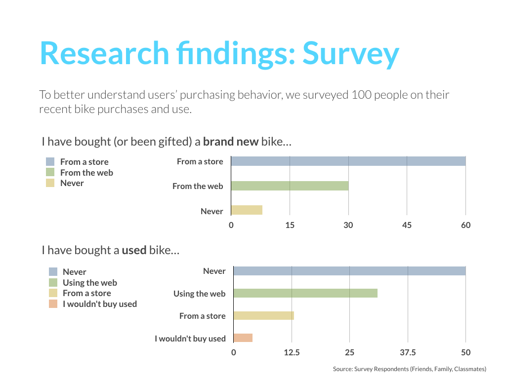
Survey
My partner did a survey that allowed us to recruit part of the people interviewed. Others were recruited by personal connections and meet ups related to mountain biking.
Insight
•Friends are the number one reason people try new hobbies
•The mountain biking community tends to be frugal and in search of experiences
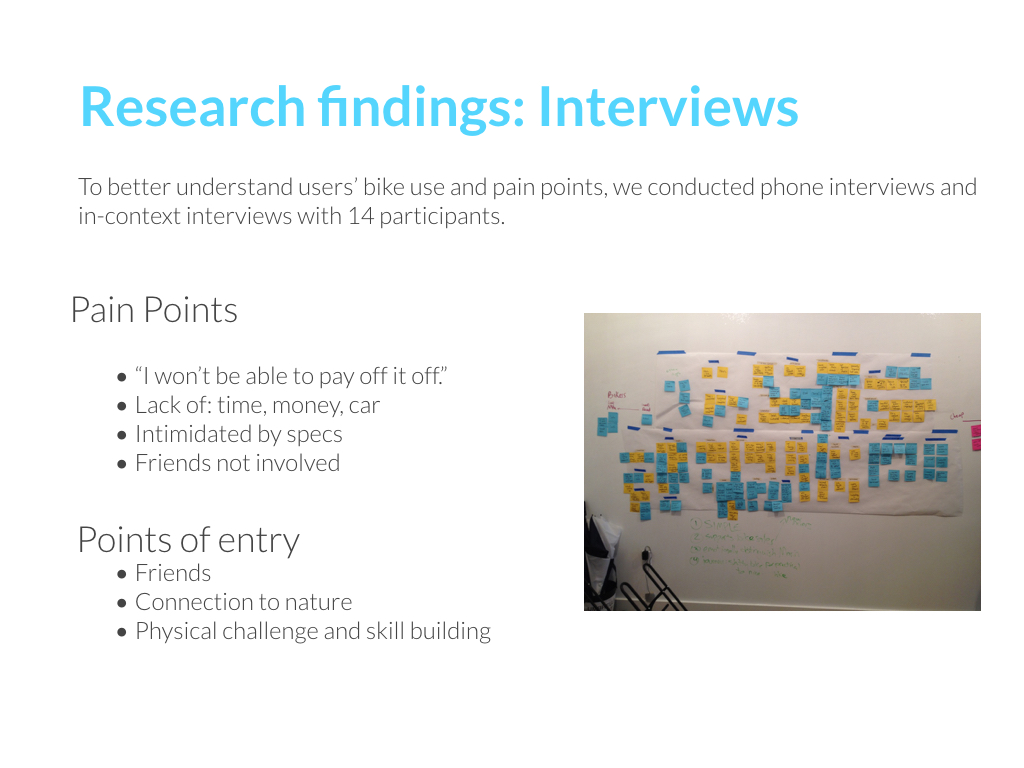
Pain Points to practice mountain biking:
•Interested, but reluctant because lack of : time, money, car.
•Intimidated by specs when trying to buy a bike
•Interested but no friends who practice
Motivations to start mountain biking:
•Friends practicing
•Mental State: connection to nature.
•Physical challenge and skill building
I asked my colleague for her interview findings and organized the information so we could all see the patterns. Looking back I should have also provided a list of insights accompanied with testimonies instead of waiting for them to trust my conclusions.
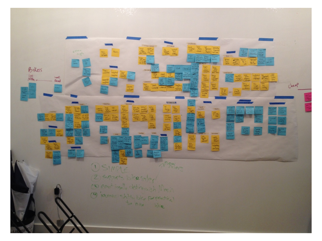
My conclusion
People need help overcoming coming obstacles to actually get involve in mountain biking. We must show people it is a good investment that won't go to waste. However, my team thought by helping people make the purchase in-store it would be enough.
Personas
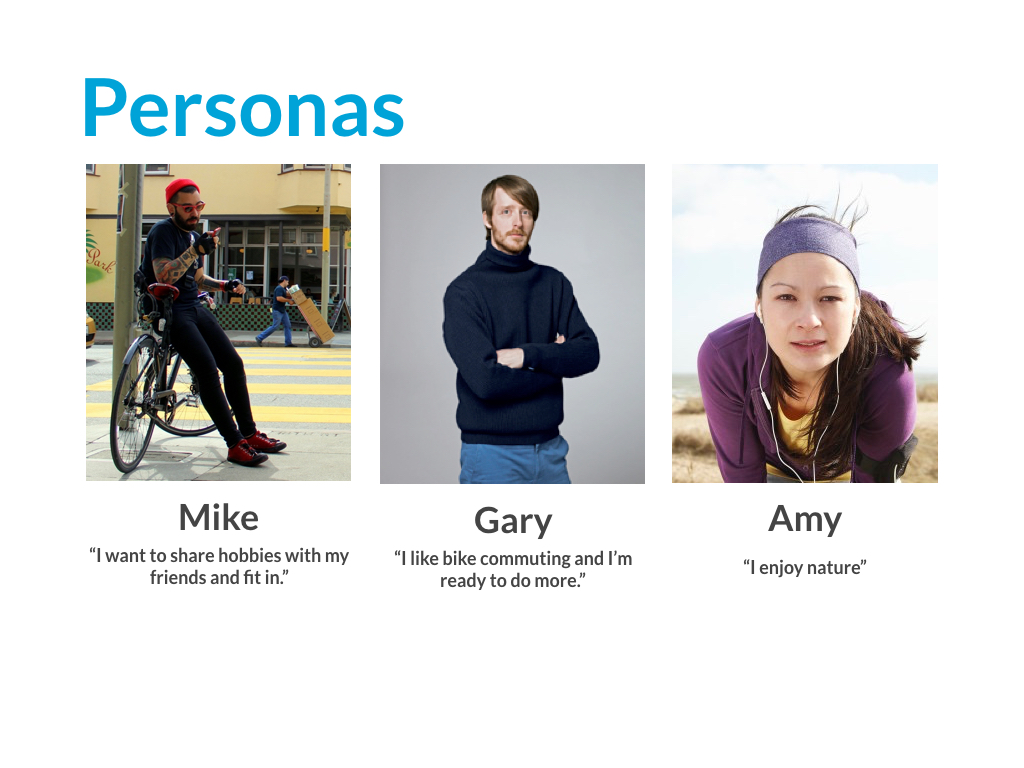
The main persona is Amy because she enjoys nature and is willing to learn and try. Other personas would benefit from a product that addresses her needs.
2. Ideation
Brainstorming, Product concept, User flows + Scenarios
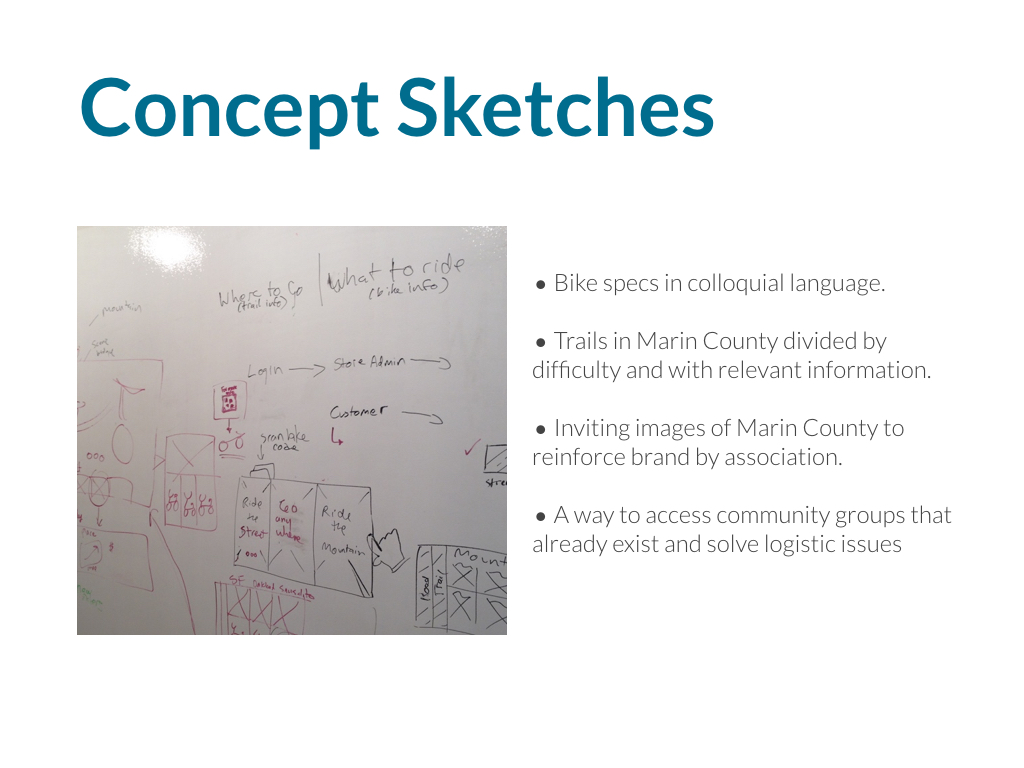
• We brainstorm ideas sketching them in 10 min session.
• We decided product concept, features and prioritized them according to Amy's needs
• We started sketching and making the entire flow of the app imagining what Amy would do in different scenarios.
• We changed our strategy and re-imagined Amy's flow
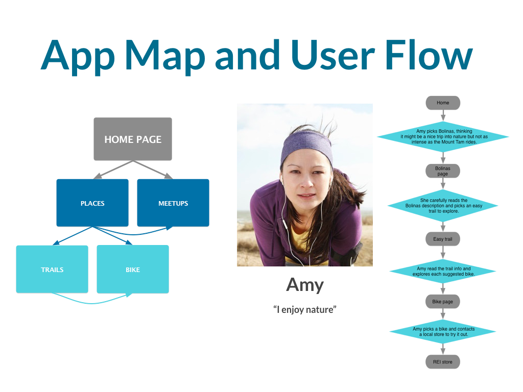
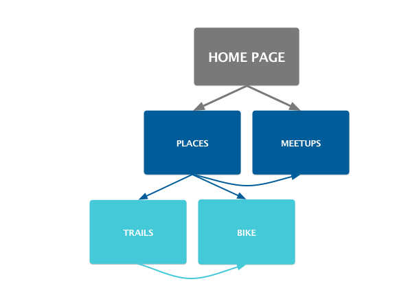
• It's a simple flow, thus a simple app map
Change of Strategy + User Flow + App site
We changed our strategy:
Instead of helping people make a purchase, we changed it to help people engage with mountain biking.
The new flow first engages people with the promise of a beautiful experience with nature. That's why if you compare our previous app map and the final map, the pages are the same but the order changes.
My partner suggested doing a "design studio" sketching session between the 3 of us in order to brainstorm our ideas of what the product should be
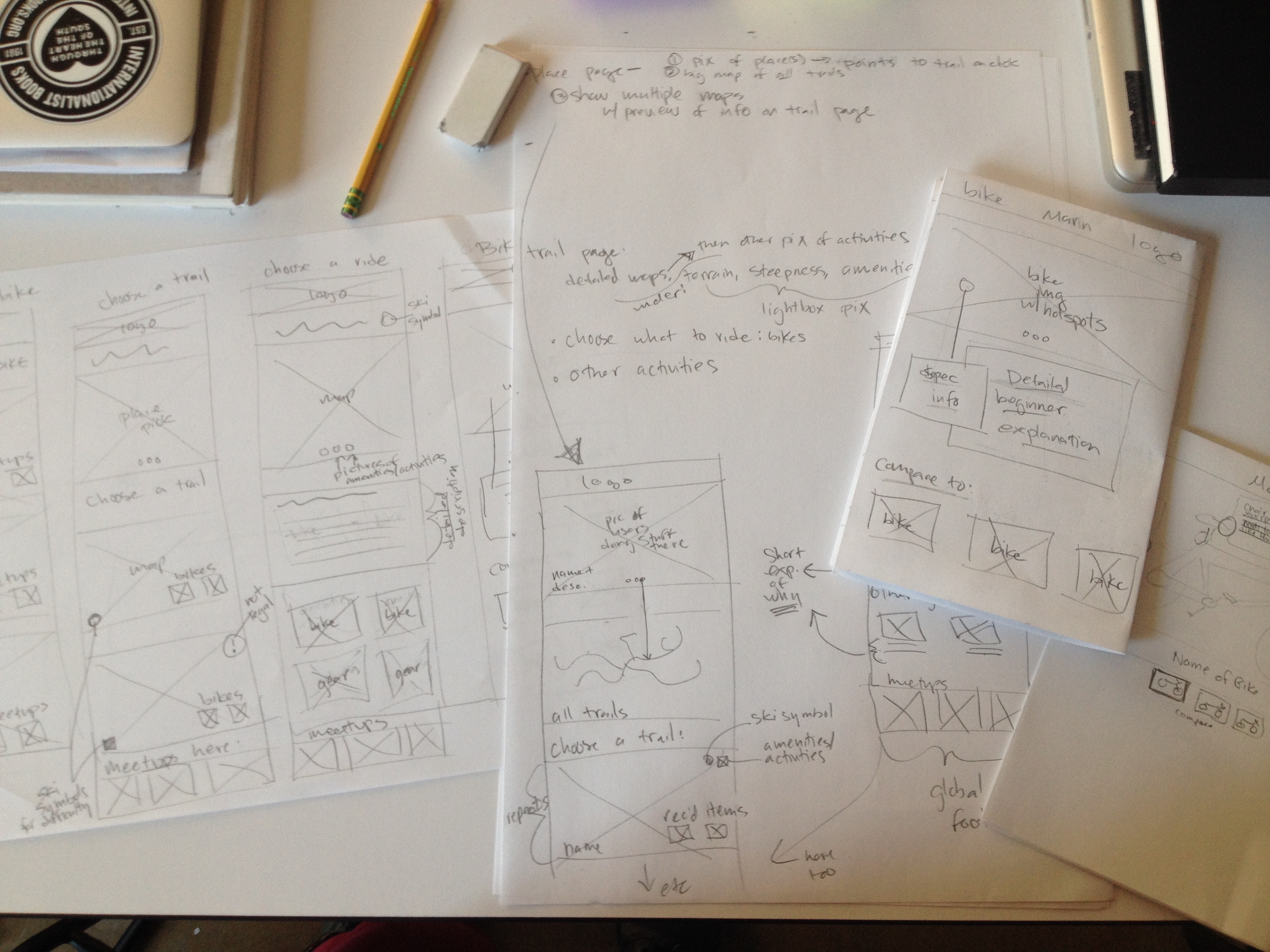
We decided the product's value proposition. At first it was an tablet app to help sell bikes at the store. While this solution was partly logical, it didn't consider that outdoor sports enthusiasts don't go to the store in the first place.
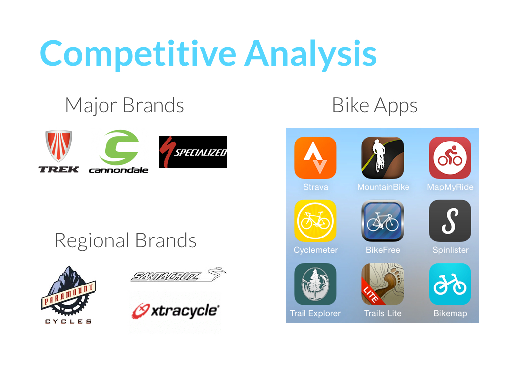
We continued thinking of a user flow for the store app. The flow started with teaching bike specs and then suggesting experiences where they could use the bike. After checking out the competition my team realized we needed to rethink our strategy.
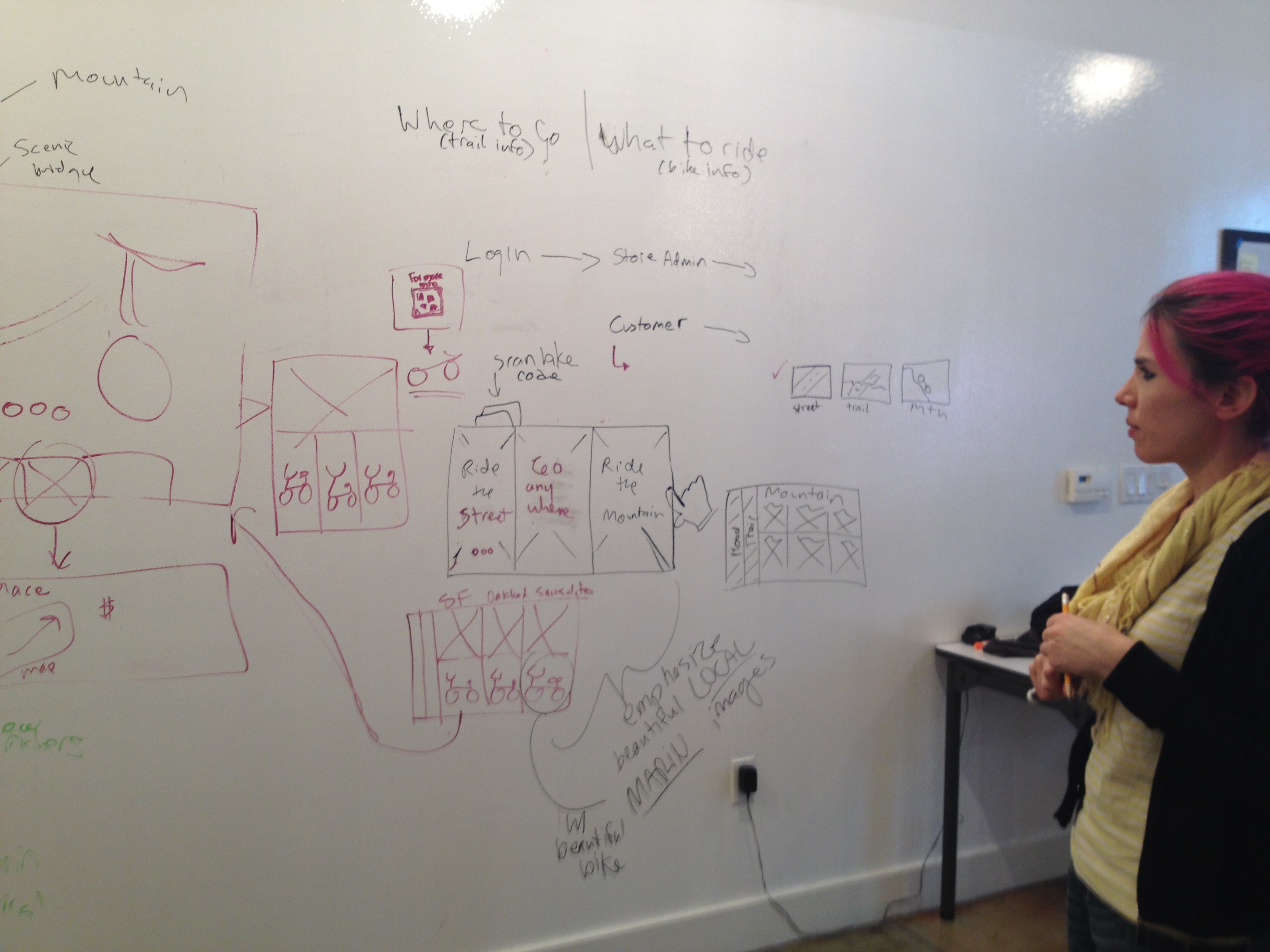
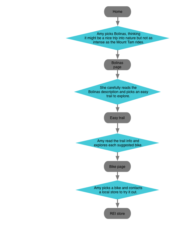
I proposed to focus on making the people see that all their fears had a solution and that their interest align with Marin's. I convinced my team by explaining we didn't have to throw away our work, but simply to reinterpret it. This image shows how I reinterpreted the previous user flow.
User flow and scenario used for Amy
Final app map
3. Prototyping
Visual Design and first iterations
My colleague had more experience with Axure. He started the prototype and he defined the visual design of the app. I assisted him with part of the wireframes and clickable items in Axure
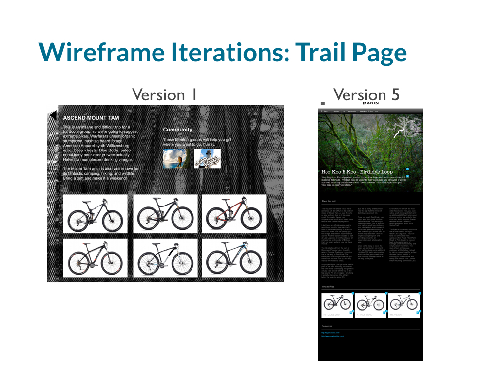
First wireframes and tap-able prototypes
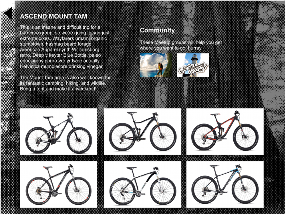
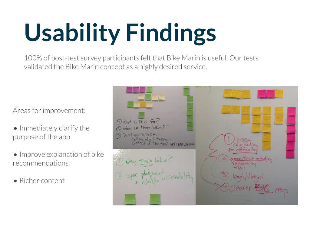
User testing of final prototype.
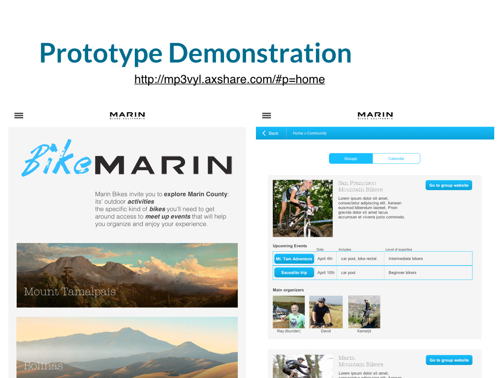
Final Prototype and User Testing
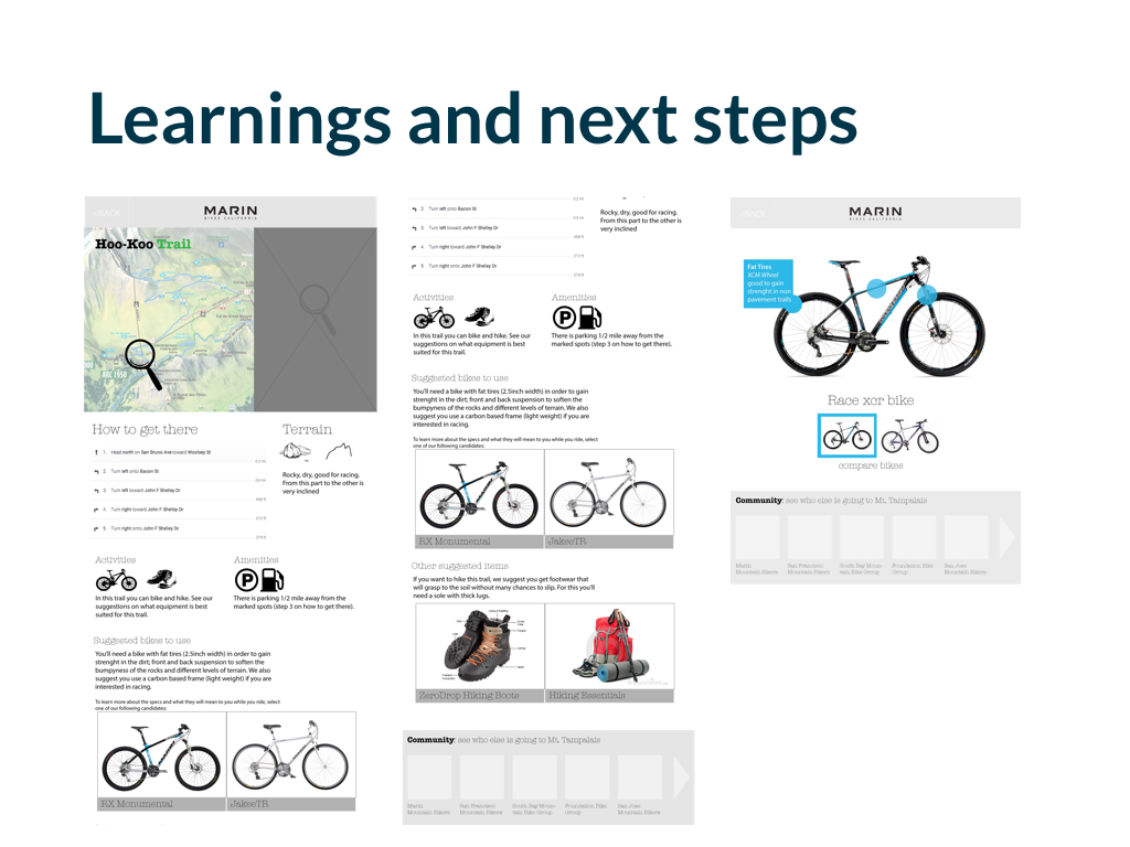
We did 9 iterations. We learned that people didn't want a catalogue of bikes.
They needed information relevant to enjoy the experience such as: a better map, equipment, ways to connect to people with cars, an specific trail information like amenities and terrain.
Wireframe of last prototype tested. Try it here
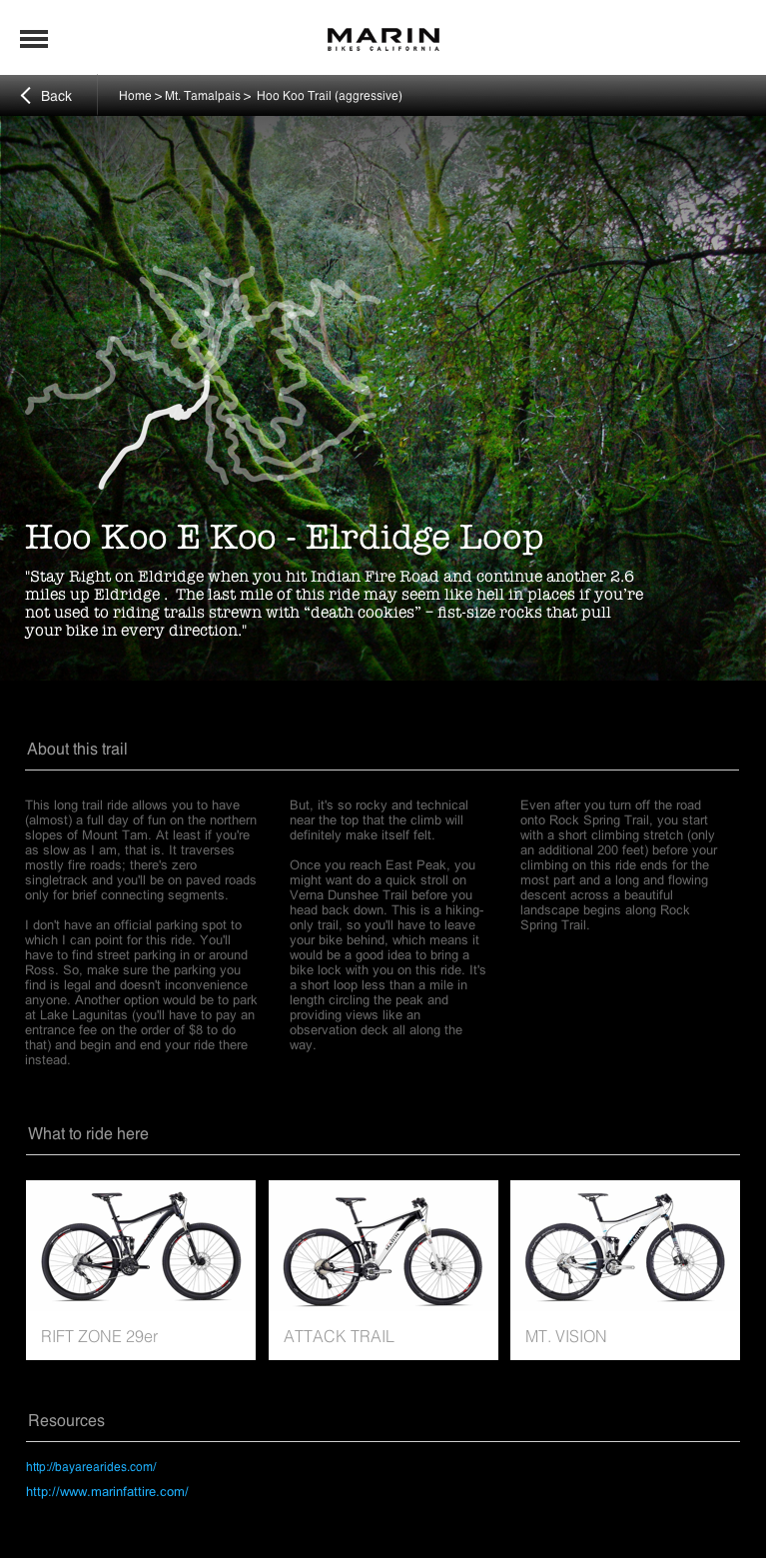
Wireframe of the prototype for mobile instead of tablet

Android wireframe: place page

I made these last wireframes after the project ended. Android wireframe: specs page - drivetrain explanation

After the project ended and on my own time I made the Android app wireframes and I made a prototype in Marvel for this portfolio
"Learn equipment for
a beginners trail"
Process
1. Research
- Survey
- Interviews + Insights
- Competitive Analysis
- Research synthesis
- Personas+Scenarios
2. Ideation
- Brainstorming + sketching
- User Flows + Product Concept
- Rethinking Strategy
- App architecture
- Design definition
3. Prototyping
- Visual Design
- Wireframes
- Axure Prototype
- User testing
- Iterations
4. Presentation
- Sitemap and user flow images
- Presentation Deck
- Client Presentation
- Last wireframes
- Android mobile app prototype
"My Role" Key
: Solo.
: Co-created with team.
: I finished on my own.
