Intra network
Creating a structure to organize the company's internal wiki
Try Prototype"Bookmark 'GIS
new data' article"
Context
Project Brief GreenInfo Network makes maps for public service institutions. They want to redesign the company's wiki so info is easily rediscover and saved. They would like employees to read and post info. Problem There was no structure nor categories everyone understood. The only way to find anything was through the search bar. It has an unnecessary password protection that became a real issue for the people who needed daily access.
User
All employees are users. But, project managers need daily access. They need easy access to recurrent information, a visible search at all times, and content organized in company's main topic areas.
Solution
•To encourage browsing and discovery with a simple user-centered IA
•To allow recurrent use with features such as bookmarks, most read and saved searches.
•To clean up the flow of needless tasks.
Other Details
Challenge/Learning
My lack of expertise on topics/terms specific to geospatial services.
Results
GreenInfo Network developed the design that adapted to new staff coming in.
Timeline 4 weeks part time - August/September 2014 My Role Lead Information Architect / UX Designer consultant
1. Research
I started with a Product Evaluation
•Use of information mixed
•No way to see what categories an article belongs to or how it relates to others
•No content preview of any kind
•No way to sort except old-new and vice versa
•No way to know context: why is it there?
Content Inventory in a spreadsheet for future use of the company

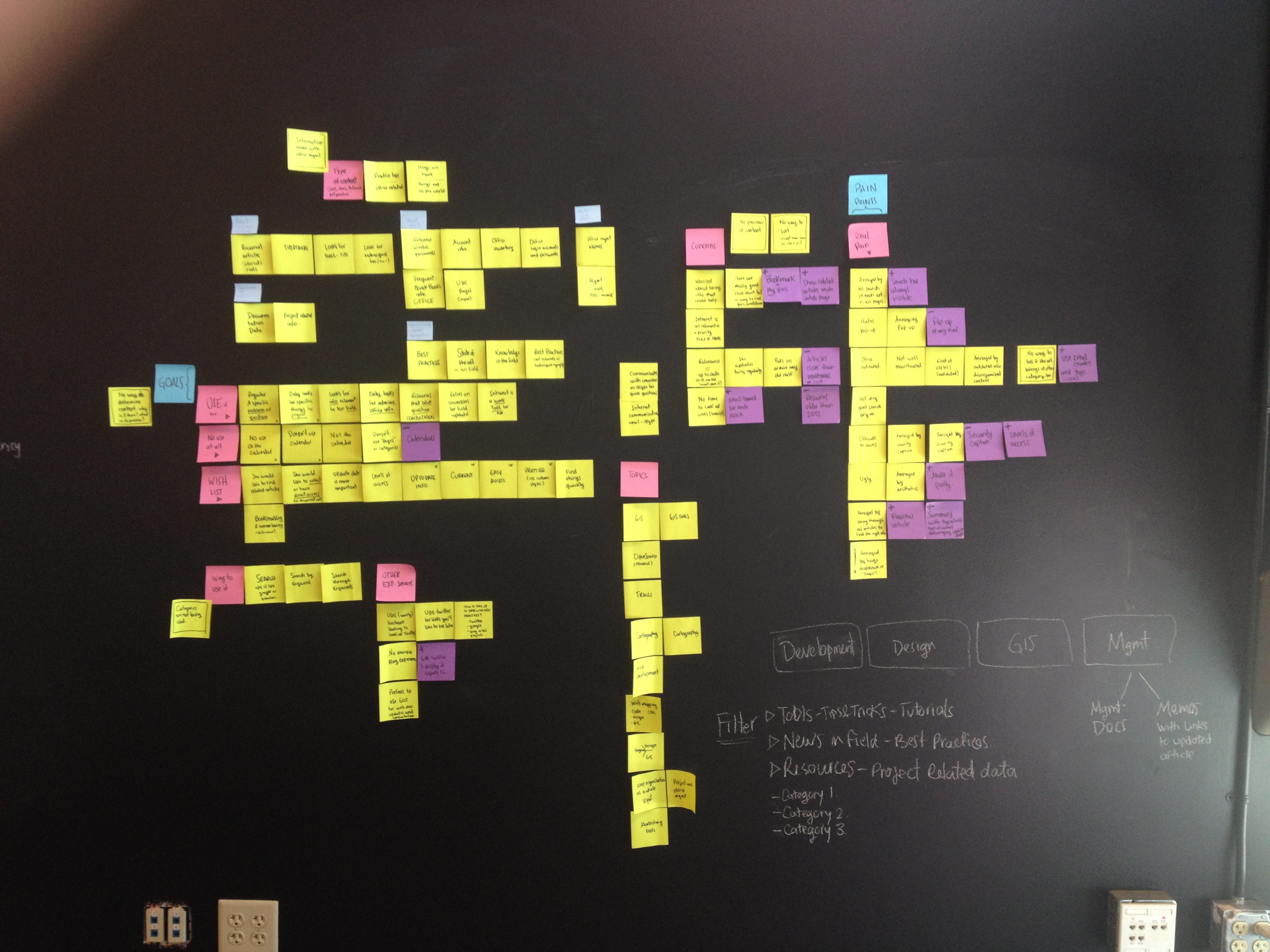
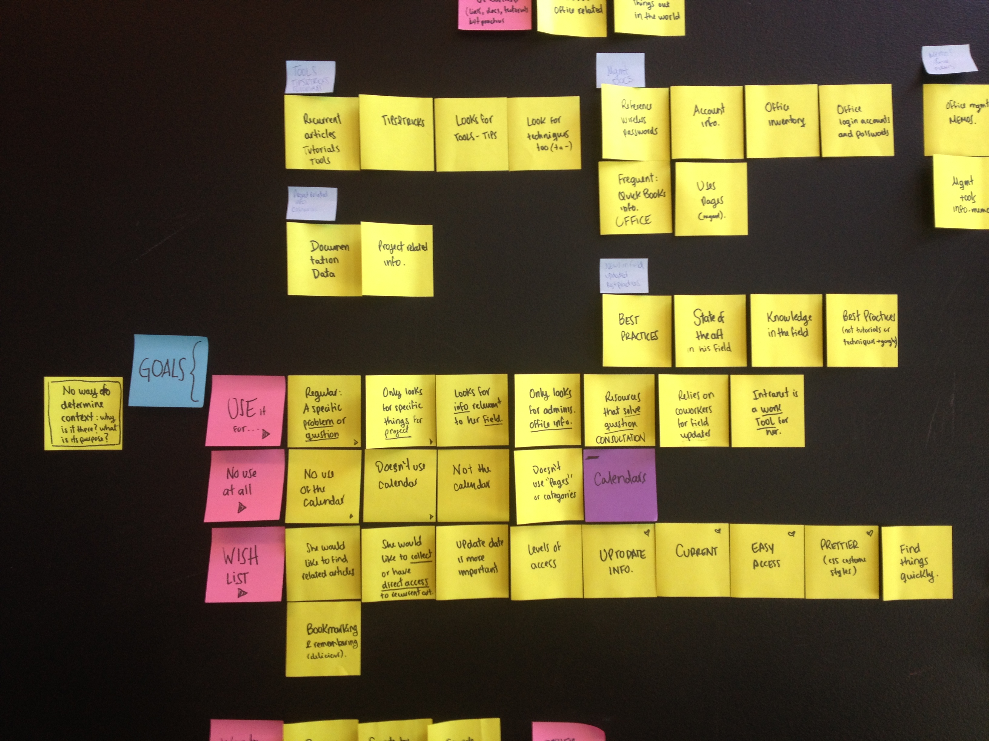
User Interviews
•The employees described the company's main areas: geospatial, development and design. Plus all management/office related info.
•GIN’s employees’ goals regarding the intranet vary between finding:
1. Tools/tutorials/techniques/tips&tricks
2. News in the field/ state of the art of a field/ best practices
3. Resources (links), project related data, consultation
4. Office related documents
5. Office related news
•In general, the intranet is viewed as “nice to have” but not relevant for the projects. They think it could be a nice consultation tool to have when needed if the content is made accessible, readable and easy to find.
•Most people considered disruptive, outdated and disorganized.
•Everyone that uses it have specific articles or content they always look for, post and try to keep up to date. The links and sharing become irrelevant because the platform is not design for it.
Personas
GreenInfo Network is a small company. They are in total 11 employees. Most of them were interviewed in their working space. Some of them work remotely.
The main persona is Edna because she needs the tool to work.


2. Ideation
Scenarios, User Flows, MVP and Sitemap
1. I created a first draft of categories and did a card sorting exercise with each employee. I did several iterations until I had good understanding of the mental model of the employees.
2. I used scenarios to imagine what the personas might do and feel. This helped me create micro-user flows as solutions to each scenario. Thus, I also determined features needed.
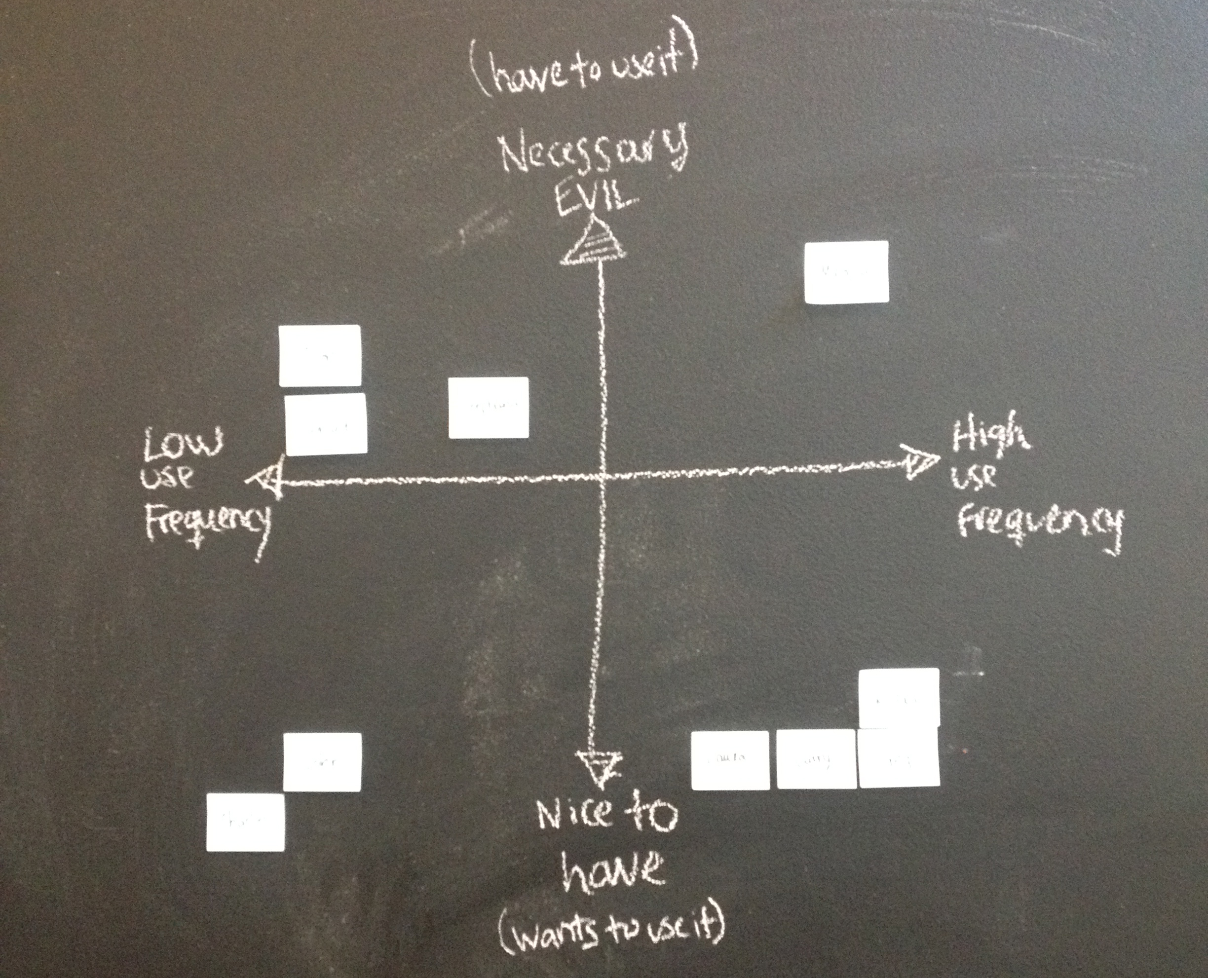
3. I prioritized actions and features according to the personas' goals and developer's capabilities.
4. I designed the final navigation and the main user flows according to that prioritization.
Card Sorting exercise: it allowed me to see how the employees saw their own role in the company, their priorities and understanding of what others do
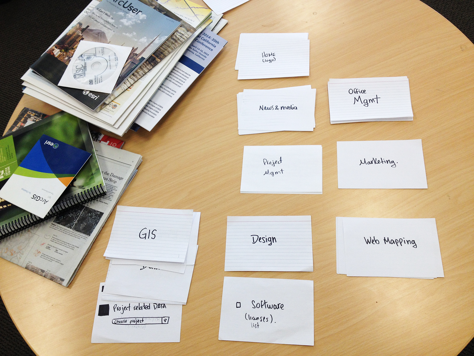
I repeated the card sorting exercise, updating the cards with feedback I got from previous rounds.
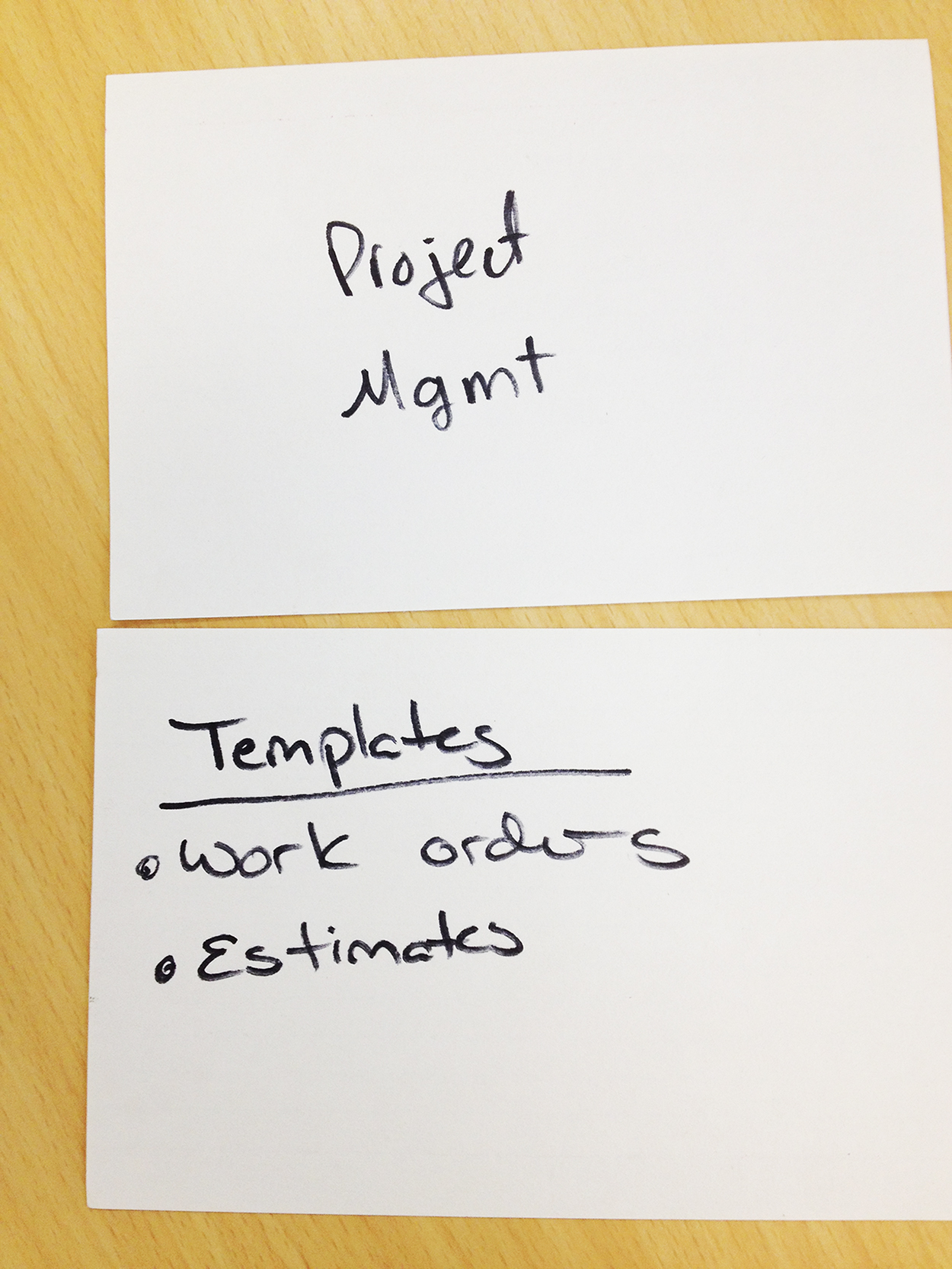
People would tell me what they considered main categories, subcategories, content or filters
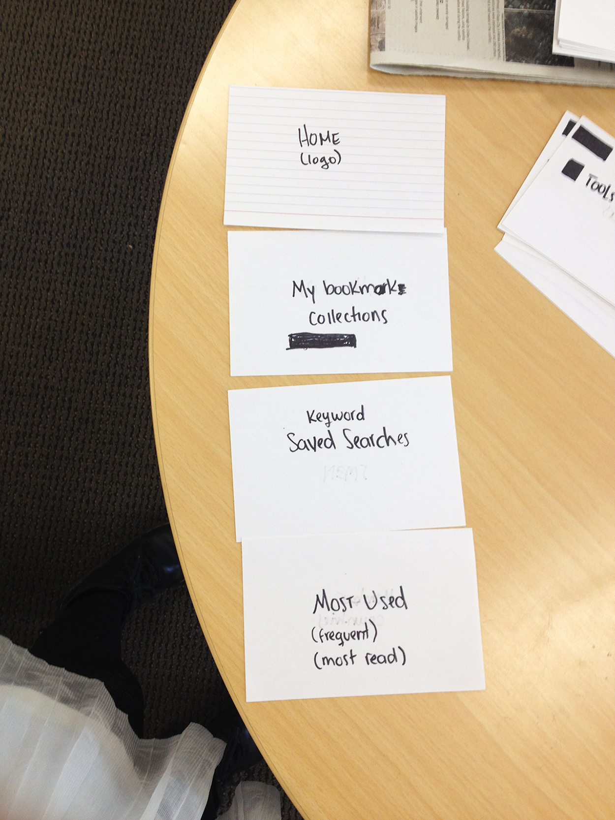
Sitemap: I made several iterations after every card sorting exercise. This is the final nav.

Example of micro-user flows relevant to each persona + scenario. I used this as a way to brainstorm solutions.

Prioritization of features: at this point I talked to the developer to see what was easy or hard to do.

User flow for saving a search

Interface sketching and design definition
The resulting sitemap had 3 levels of hierarchy. That means people would have to dig deeper than (research indicated) they would. As I sketched different options, I realized I had encounter a similar problem in the past when I made an e-commerce. I tried using the same interface: within each main category there is an internal nav that feels like tabs .
3. Prototyping
Prototype and User Testing
Once I had very clear structure, I jumped straight to Muse and reused a lot of elements I had from the previous e-commerce website. I tested it with all the employees, made a few adjustments, and tested them.
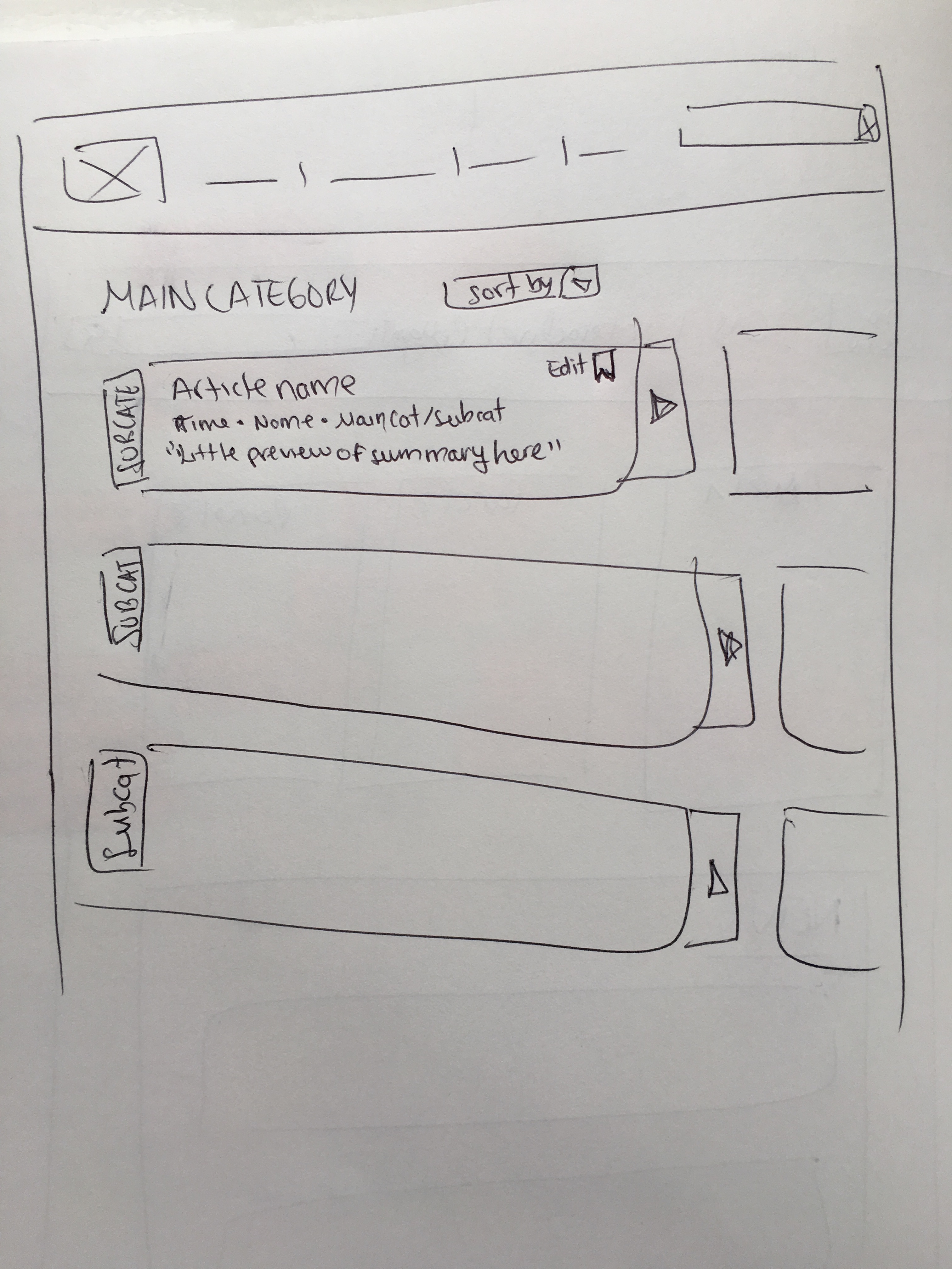
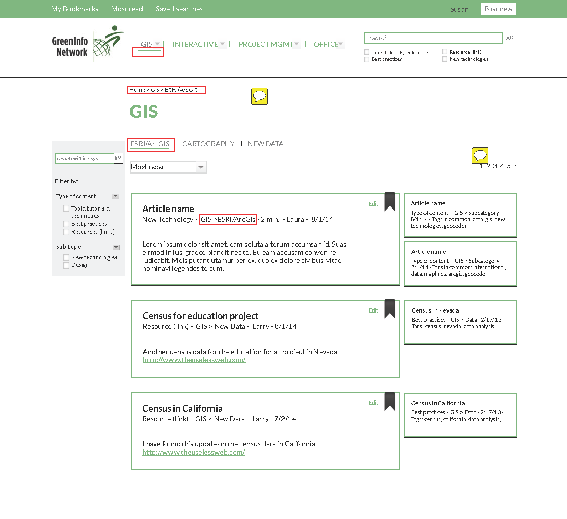
PDF Notated Wireframe of a main category
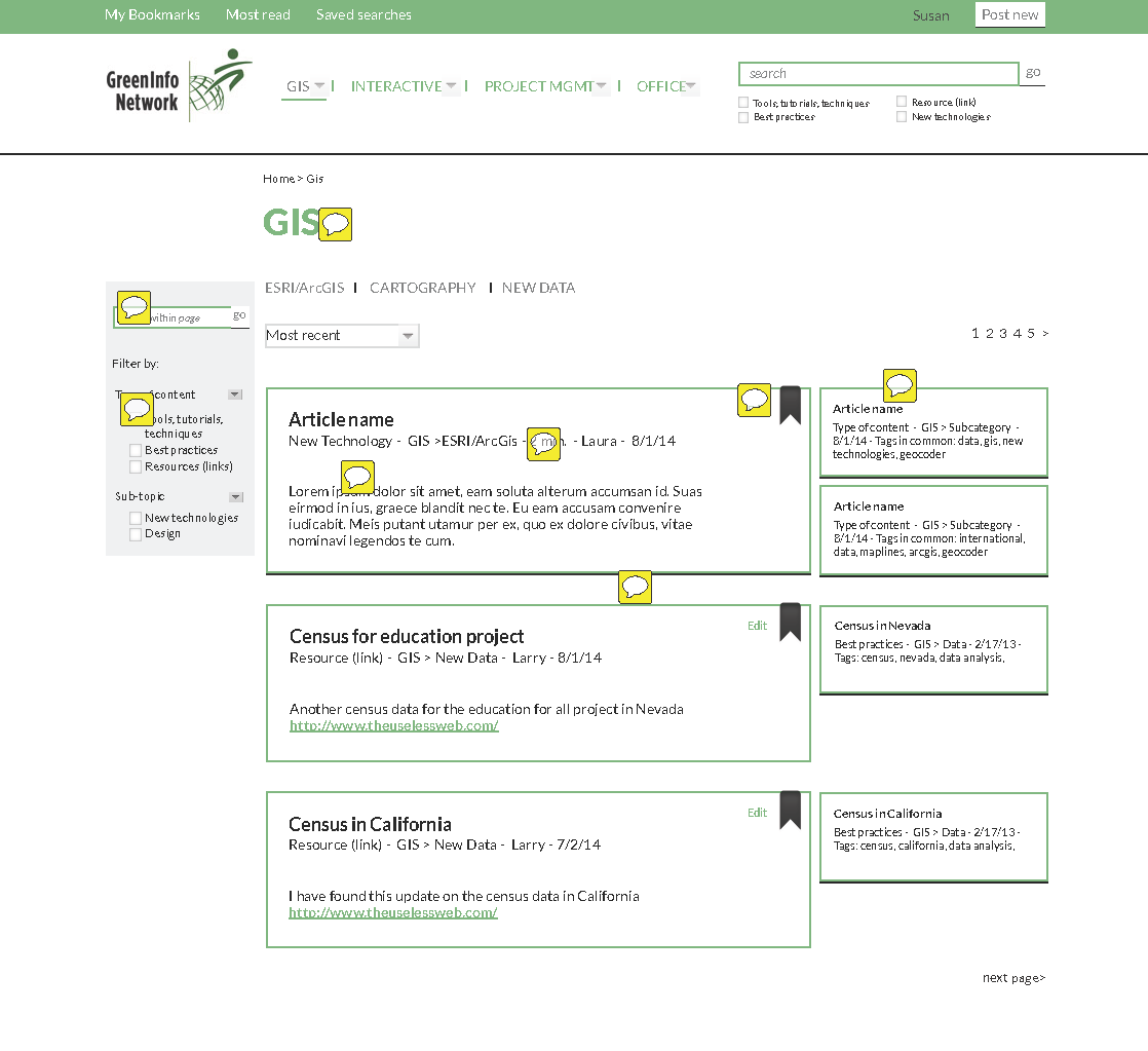
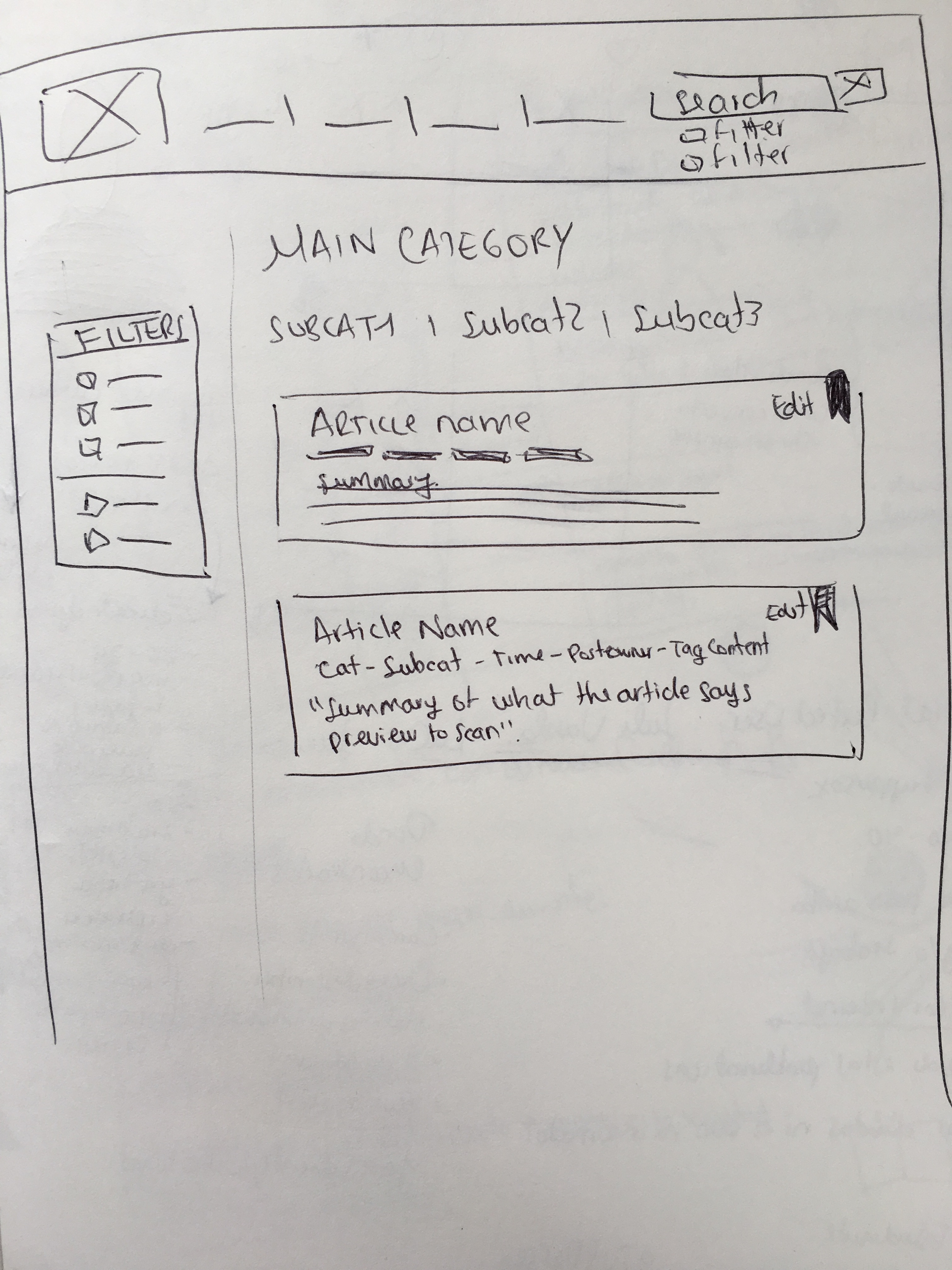
PDF Notated Wireframe of a subcategory
Choose to:
1. Open and Bookmark a New Data article
2. Search "Census" and save that search
3. Go to a most read article
4. Presentation
Presentation to GreenInfo Network
The developer in charged to make it asked me to deliver a pdf format of the notations. They felt relieved to see a beautiful UI on top of a clear architecture. I got another project after this.
Diana loves solving complex information design problems. She's able to learn about and conceptually organize large sets of data and other information, and develop user experience/interface approaches that get at the best approaches for making that information accessible. She has good process tools for interviewing stakeholders, organizing and prioritizing systems of information and reporting back on good designs.
– Recommendation by Larry Orman
Executive Director, GreenInfo Network
Process
1. Research
- Content Inventory
- Competitive Analysis
- Interviews
- Research synthesis
- Card Sorting
- Personas
2. Ideation
- Scenarios + User Flows
- Strategy + MVP
- Card Sorting + Sitemap
- Sketches
- Design definition
- Iterations
3. Prototyping
- Wireframes
- Muse Prototype
- User testing
- Iterations
4. Presentation
- Presentation Deck
- Presentation to employer
- Wireframe Notations